Pastel Dancers

dress rehersal with pastels

I recently visited the Metropolitan Museum of Art and reconnected with my favorite painters, the Impressionists. I took the time to really study the strokes and fluid lines of Manet and Degas, and got a bit inspired I guess. What I really focused on were Degas’ pastels, which I’ve always loved.

I have used soft pastels many times in my art life. When I was in art school, soft pastels were a favorite medium for me. But in the last couple of decades I’ve moved around a lot, and have had some kind-of makeshift studios. Acrylics seemed the best choice, as they are so hardy, easy to work with, and easy to store (you just pile them in a corner, really. Well, that’s what I do). Pastels, on the other hand, are extremely fragile: just touch a pastel painting and you come away with the pastels on your fingers!

(Note that from here on in, when I speak about pastels, I’ll be referring to soft pastels in stick form; oil pastels are an entirely different medium, though I might cover those some day).

But at the same time, pastel is a beautiful medium, full of color and motion. Degas, Monet, Cassatt and Toulouse-Lautrec all loved working in pastels because the medium is so immediate. Remember these painters did not have quick drying acrylics or water soluble oils: an oil painting takes weeks or even months to set and dry. Pastel is ready the minute you stop painting!

Edouard_Manet_045

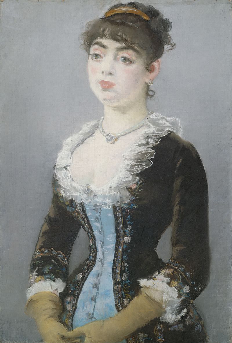
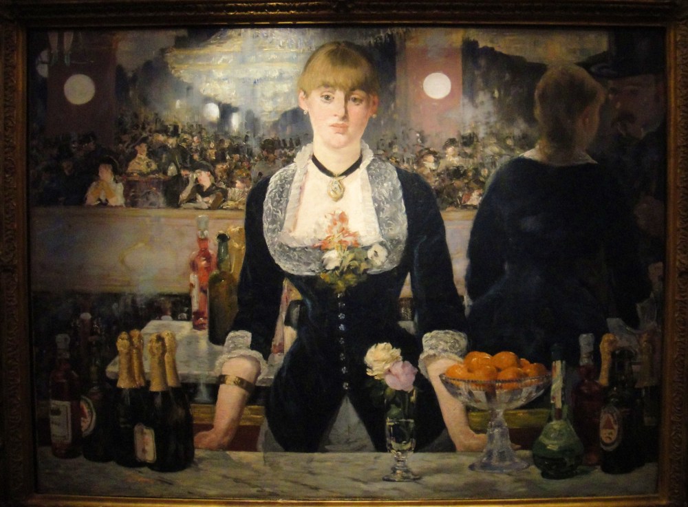
Edouard Manet, Madame Michel-Lévy, 1882; Manet used pastels on paper for this portrait. Look at the very delicate lines of the collar; also see how he implied texture and contour with quickly scrawled lines in the clothing and hair.

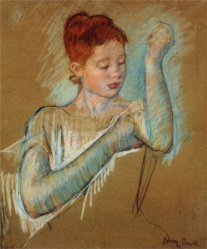
Below a pastel painting by Mary Cassatt. Again, note the motion and fluidity expressed by quickly drawn lines in the shading of the hands and arms, offset by the careful description of the facial features. Also note the beautiful unfinished quality of the torso, shoulders and neck: this calls the viewer’s attention to the most finished parts of the piece, while still implying the fullness of the composition.

cassatt

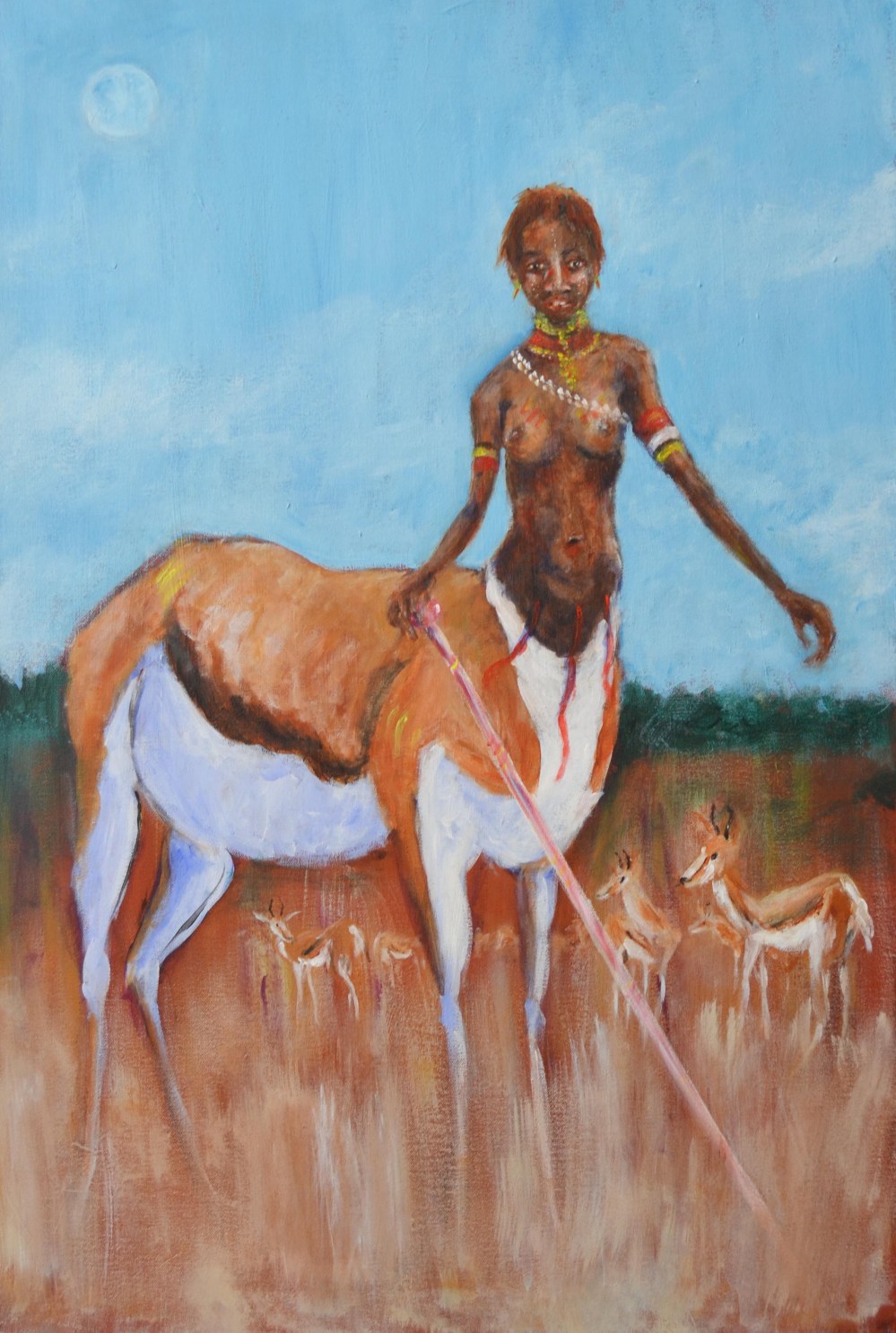
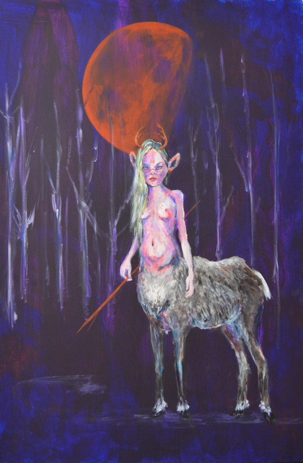
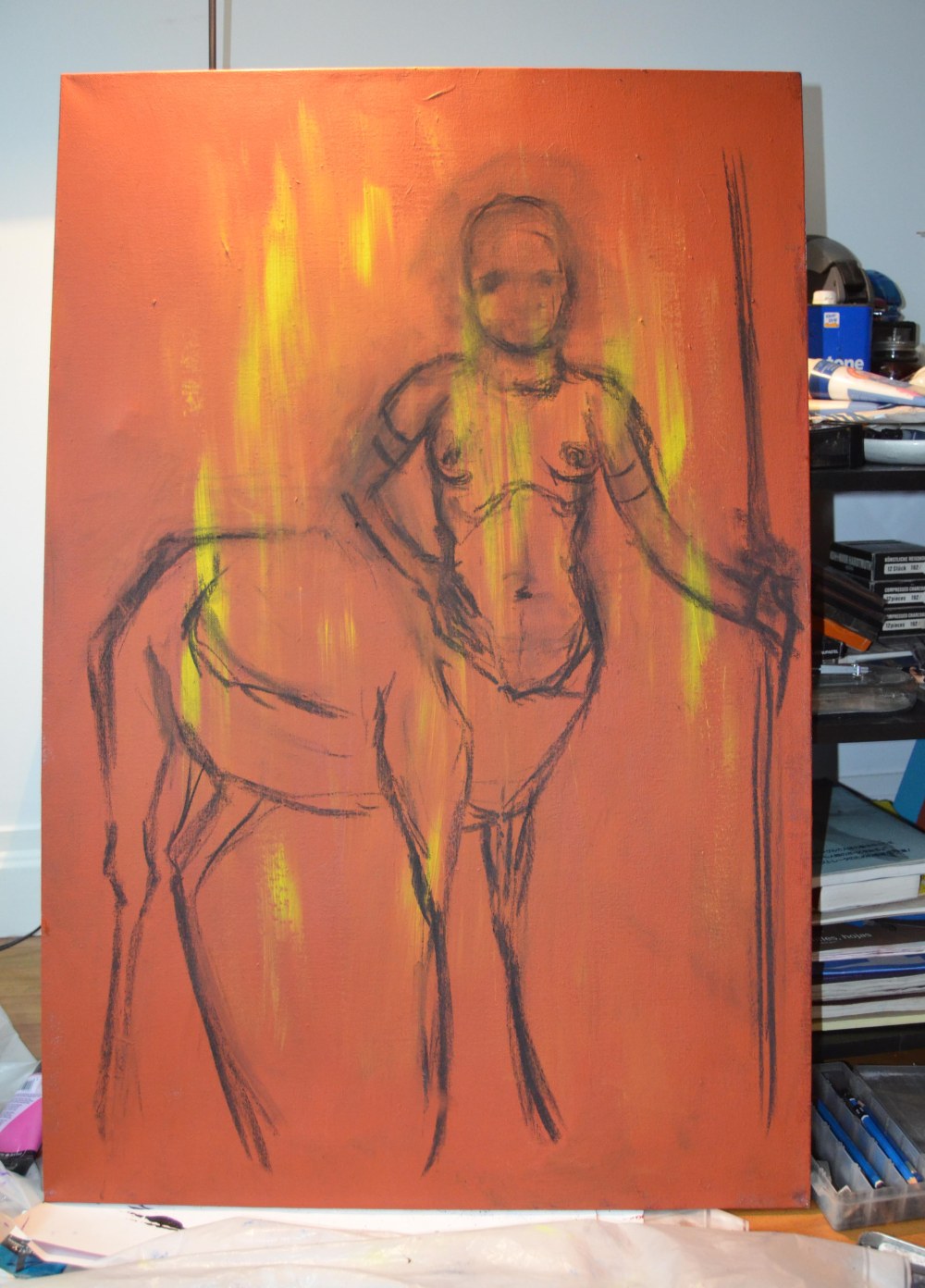
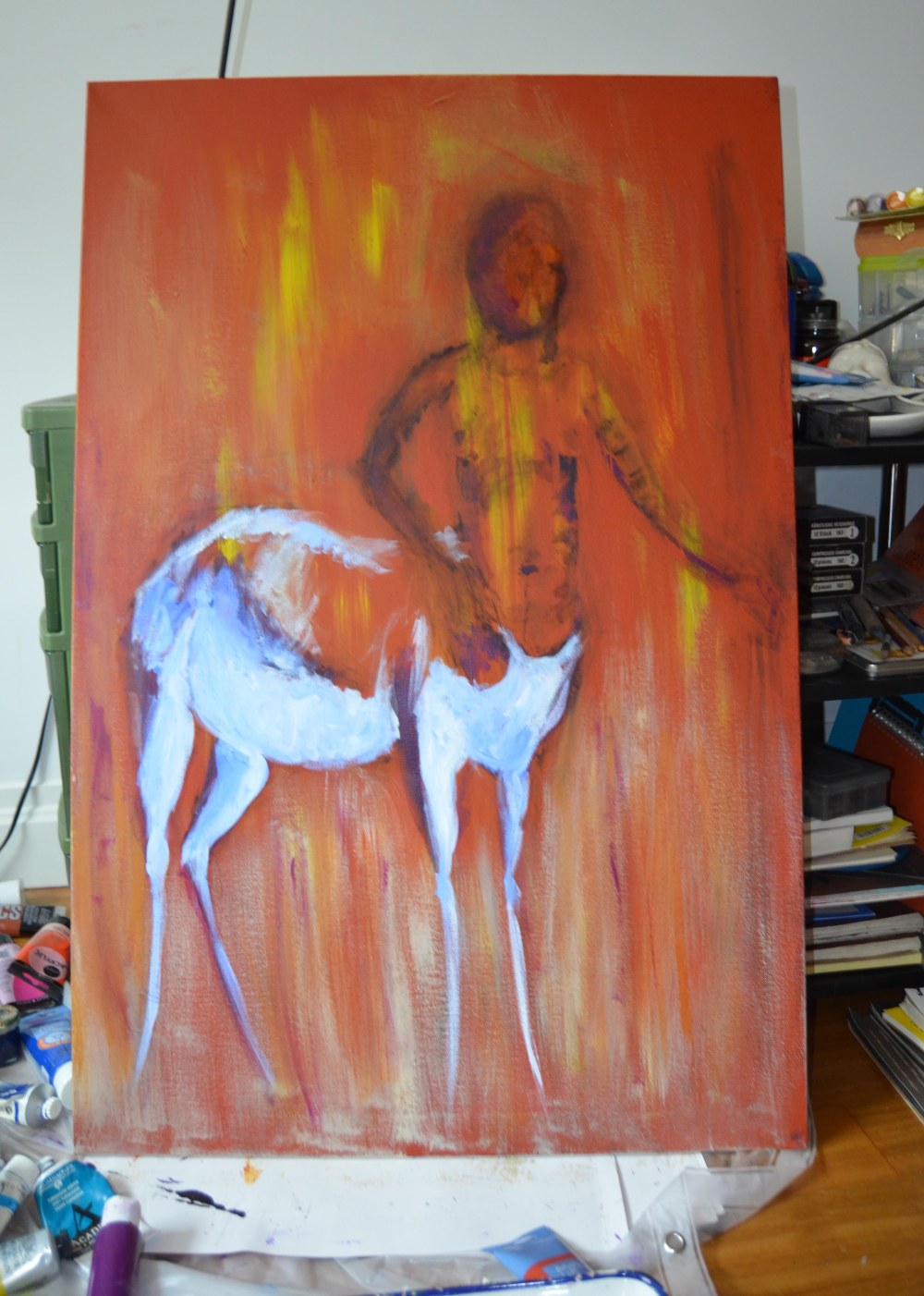
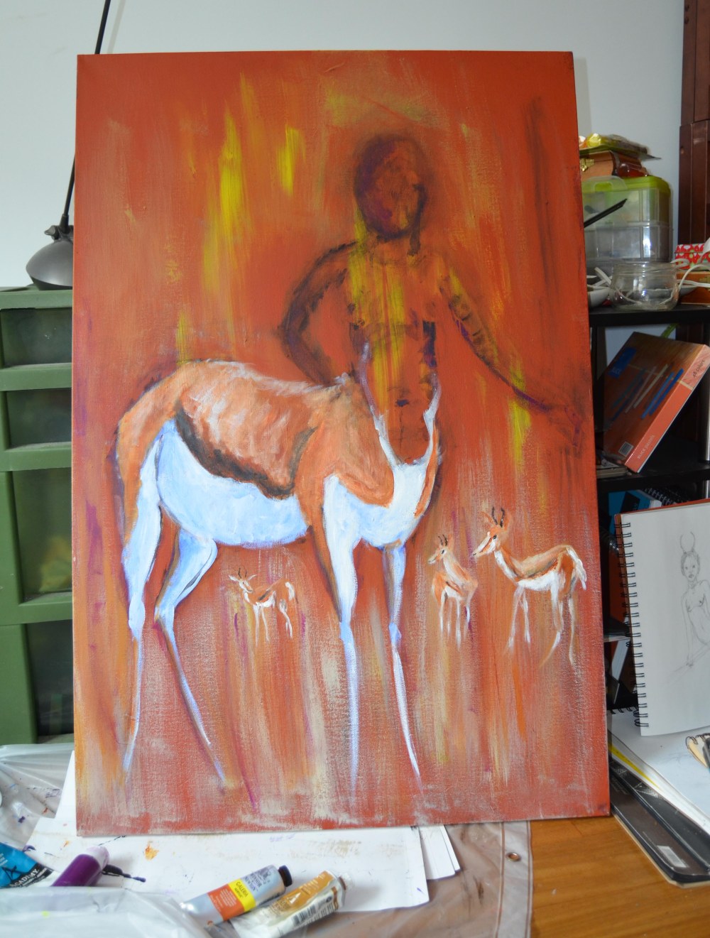
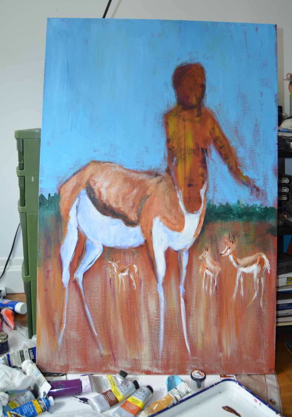
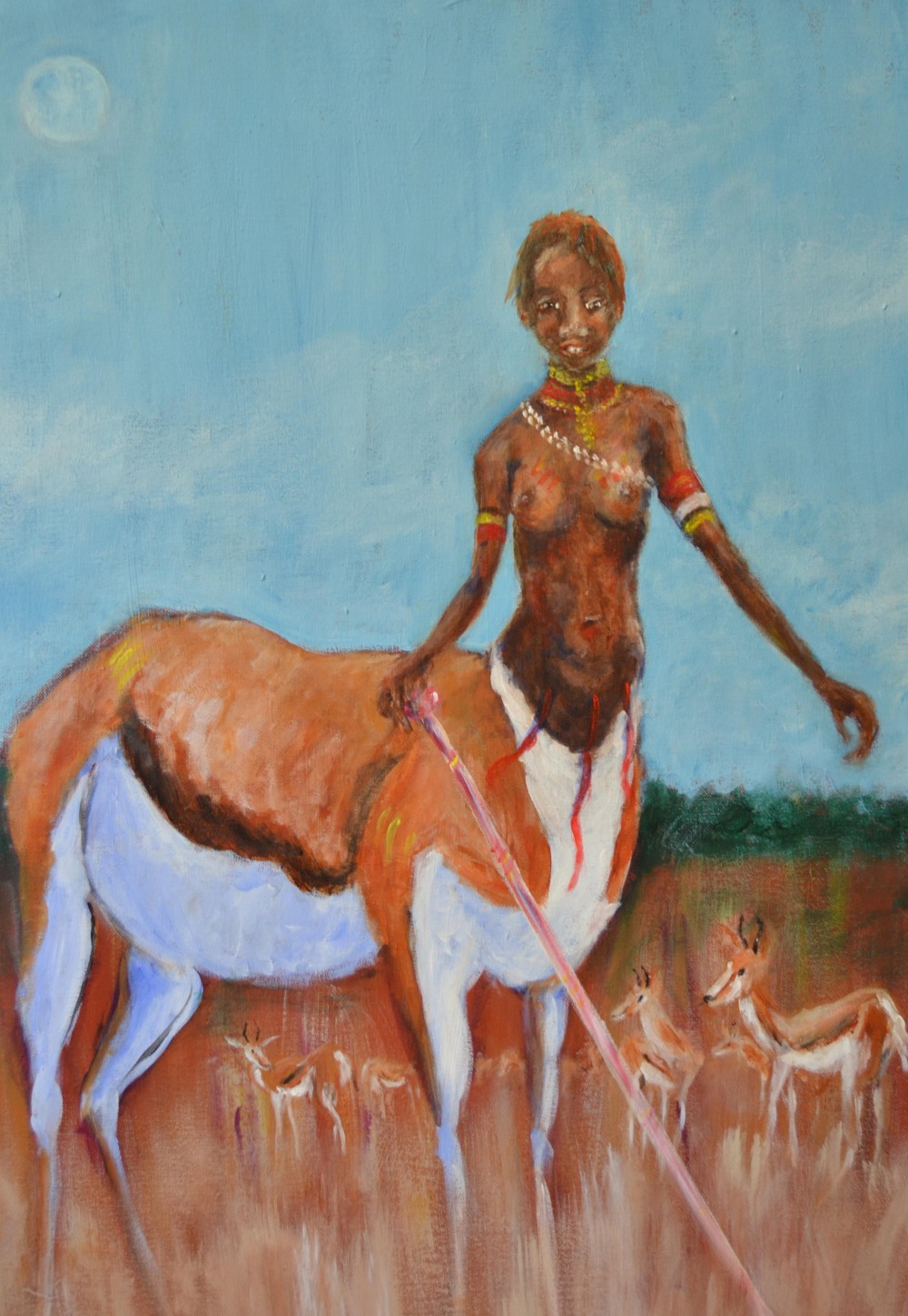
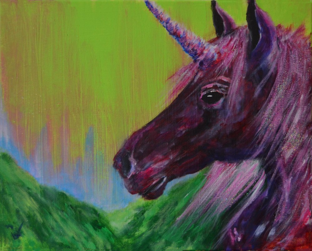
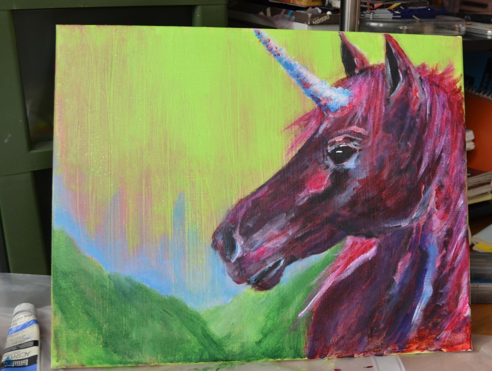
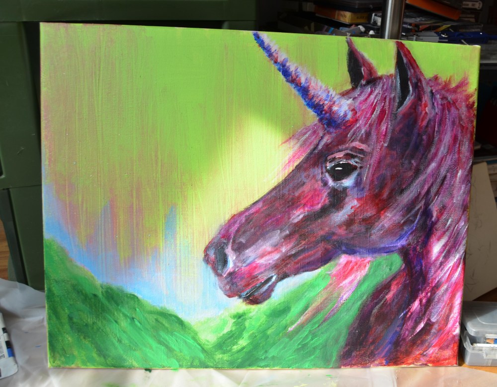
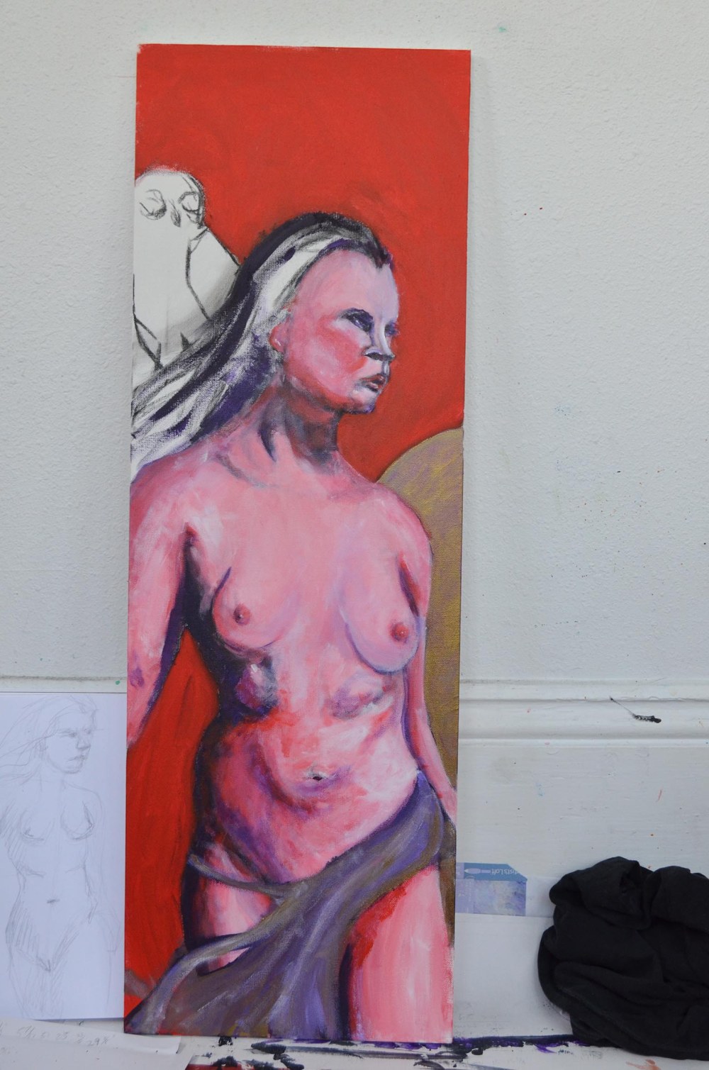
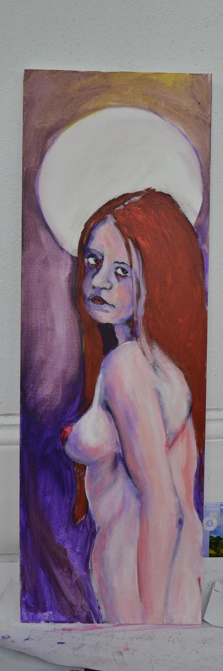
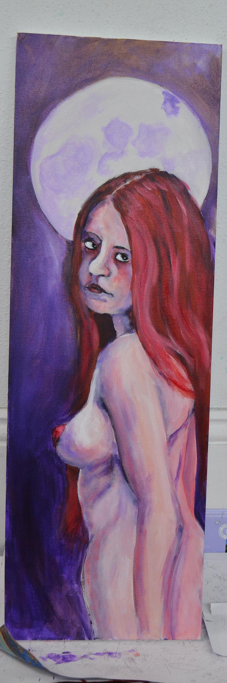
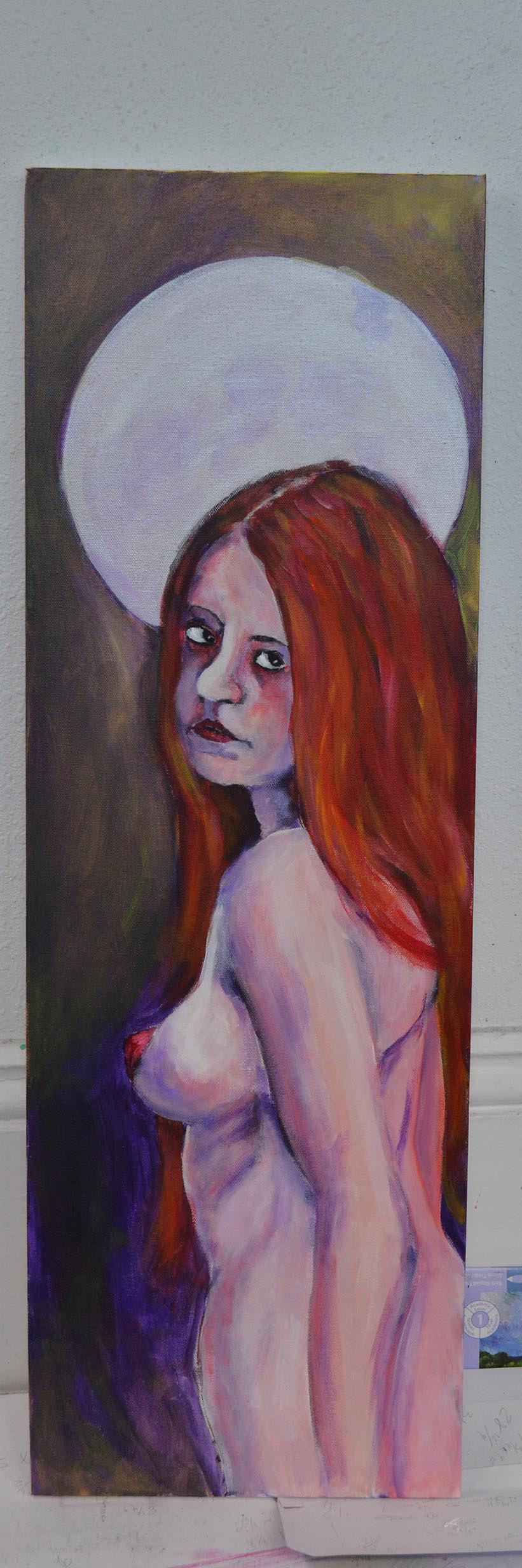
I decided to take a pause from unicorns and centaurs for a little bit (but not too long) to do some painting with pastels, and to return to one of my favorite subjects, dancers.

dress rehersal with pastels

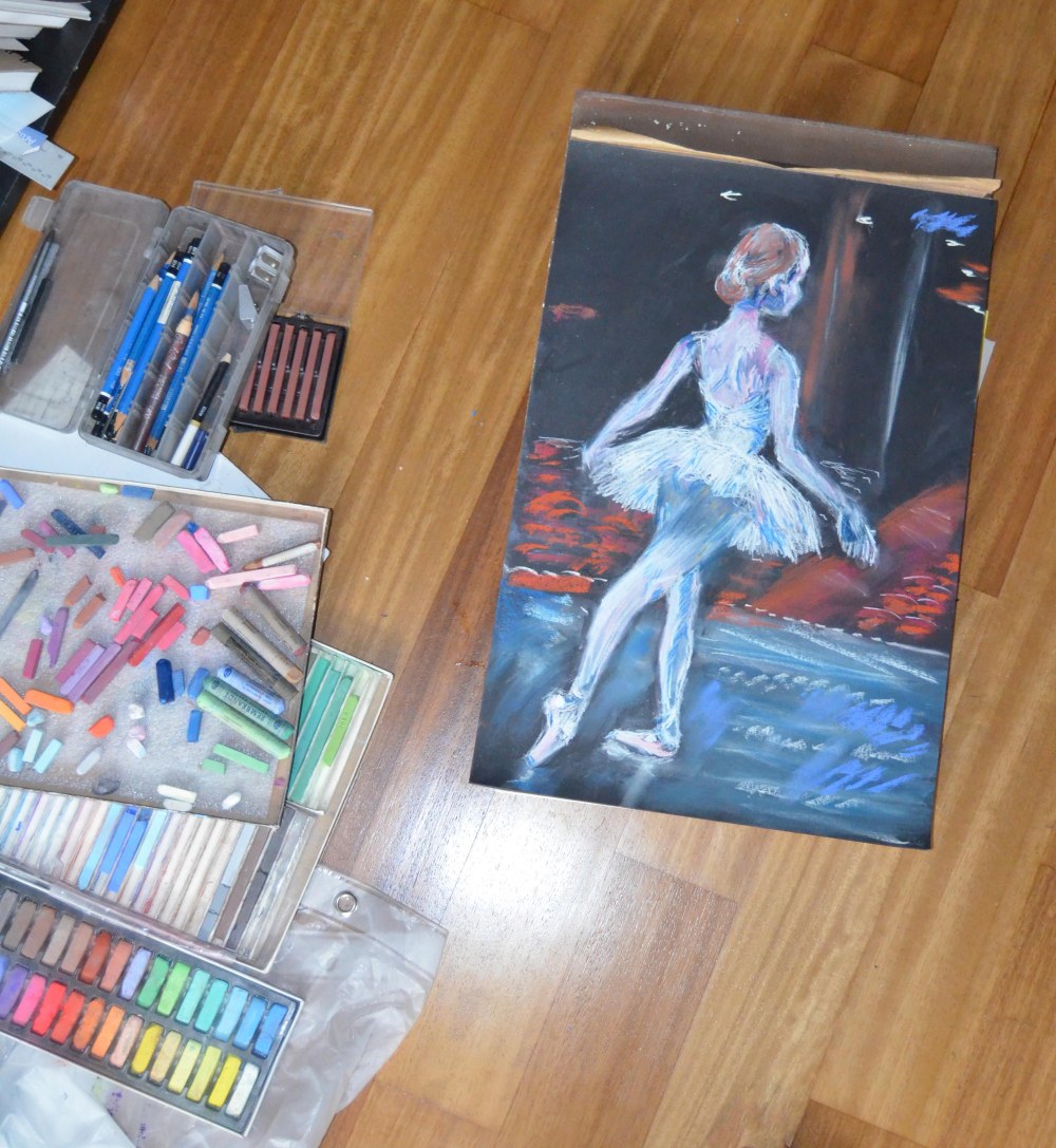
Dress Rehearsal, seen with my various boxes of soft pastels in my current very makeshift studio.

Painting with pastels can be really tricky. To quote Wikipedia: “Pastel techniques can be challenging since the medium is mixed and blended directly on the working surface, and unlike paint, colors cannot be tested on a palette before applying to the surface. Pastel errors cannot be covered the way a paint error can be painted out. Experimentation with the pastel medium on a small scale in order to learn various techniques gives the user a better command over a larger composition.”

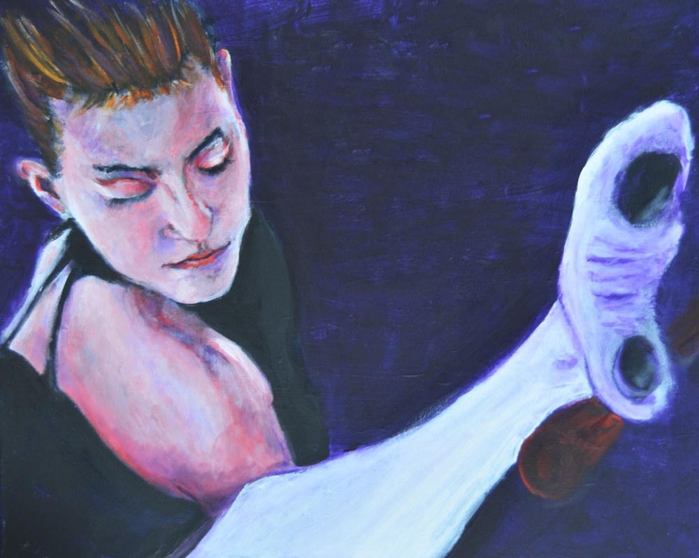
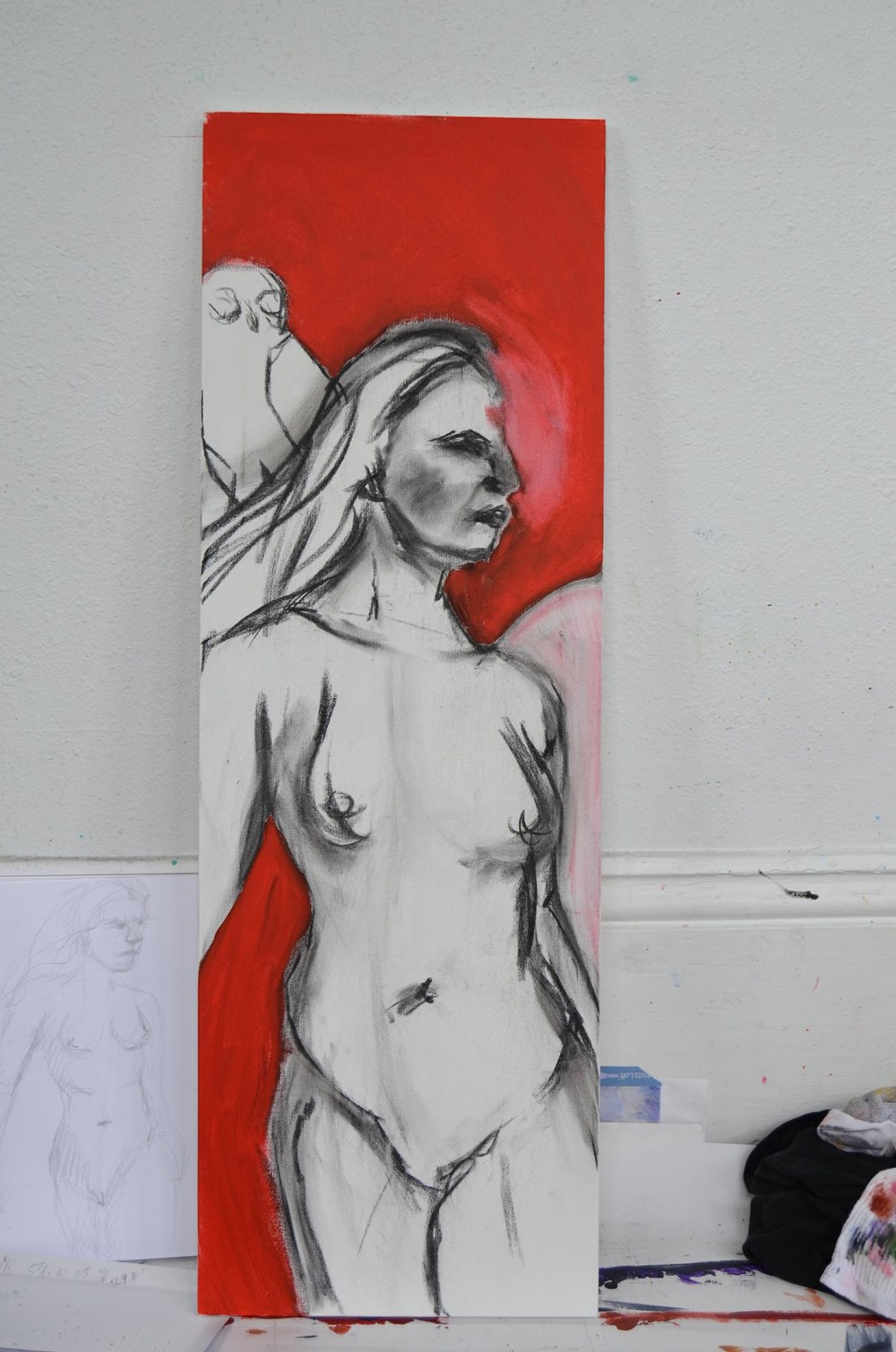
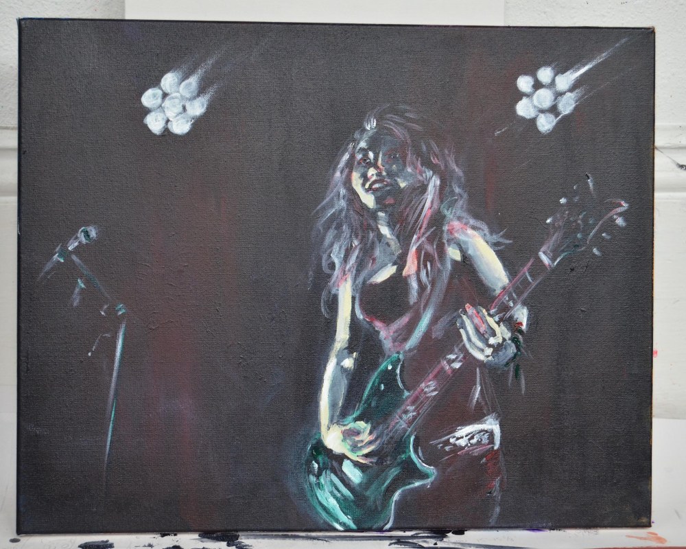
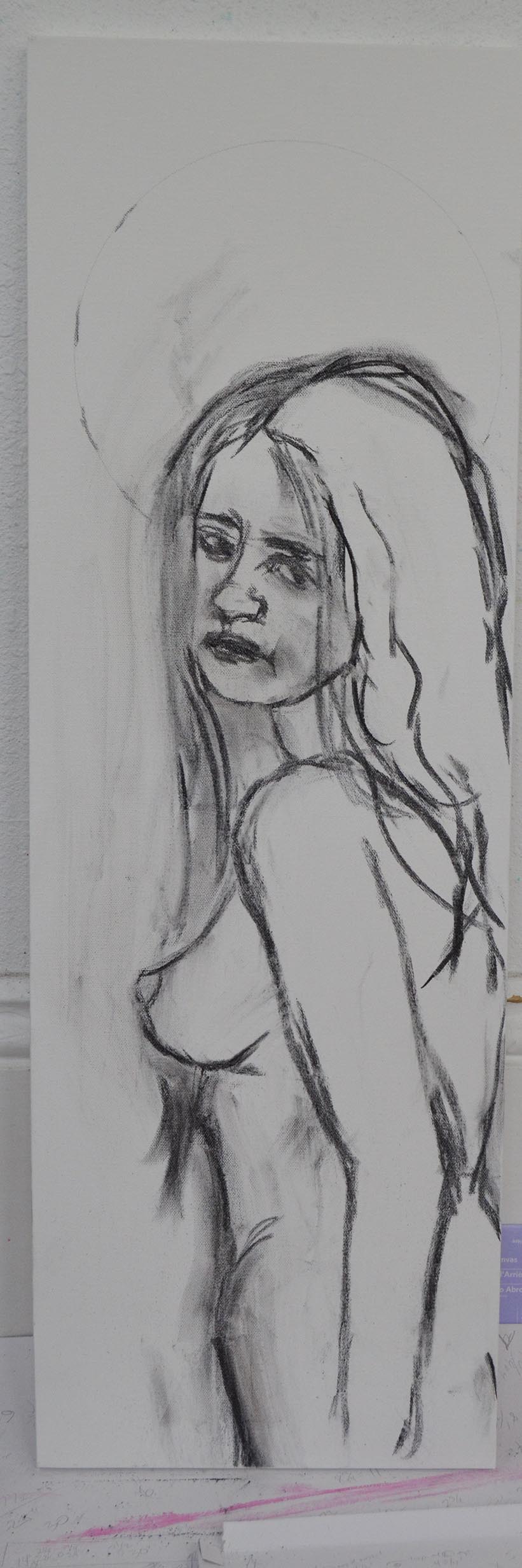
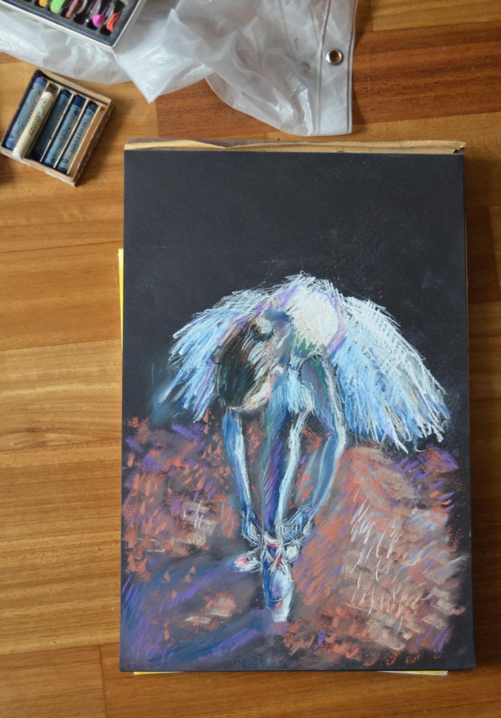
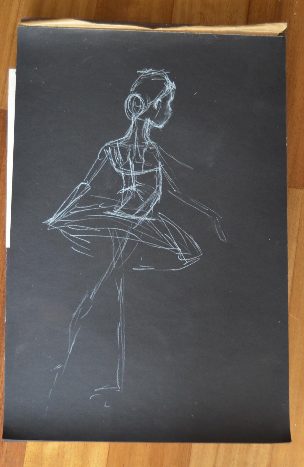
I’ll go over my process with two pieces I just finished. First, let’s look at my incredibly creatively titled Dancer 8:

dancer 8

Dancer 8; pastel on black paper.

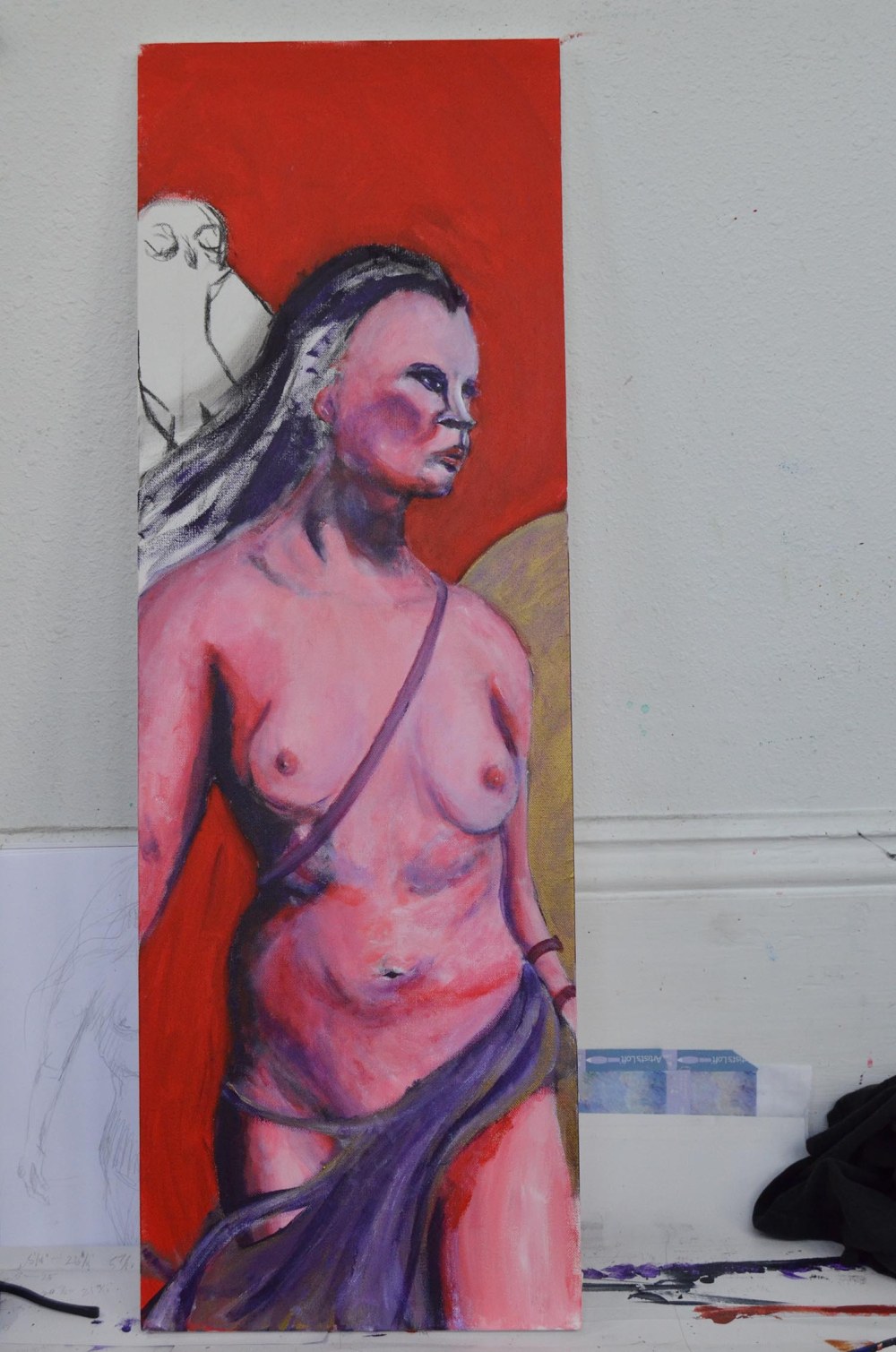
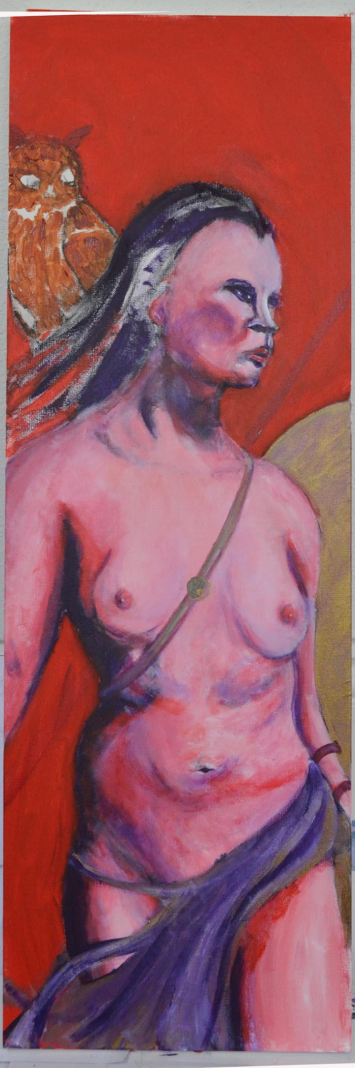
Pastel paper has a light “tooth,” or texture, to hold the pastels. If you over-paint (apply too much of the medium) you lose the tooth, and your pastels will not set onto the paper. For this painting I began with black pastel paper; I have a couple of pads of black pastel papers lying around my studio. You can also buy pastel papers in grey, sand, powder blue, etc. But I didn’t have any of those and I’m lazy. Besides, I like the look of bright pastel against a black ground (ground is the term for the surface you draw or paint on). Black seemed appropriate for these paintings because they will imply the darkness of a theater or rehearsal space behind the brightly colored dancer. Also, as I mentioned, I’m lazy.

dancer 1

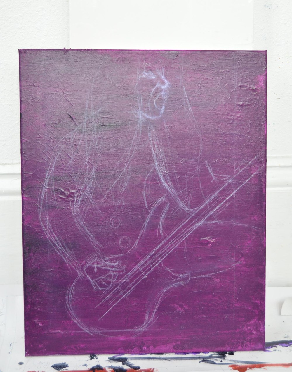
I start by drawing an outline using a white chalk pencil (I’ll talk more about beginning drawings in a minute). I like using white chalk because it’s easy to blend the chalk into the pastel painting. Chalk and pastel are essentially the same medium, a color pigment combined with a clear binder. Chalk is more “dusty” than pastel, but not a lot more. You might also use charcoal or colored pencils when painting with pastels. These are all similar mediums and blend well together.

For the drawing I wanted to capture the very basic shapes of the dancer adjusting her laces before taking the stage. I paid special attention to the lines of her limbs, making sure to capture the form of the muscles, knees, elbows and shoulders. Her face is mostly hidden, but her ear and neck are defining features.

dancer 2

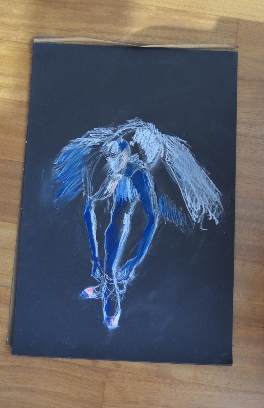
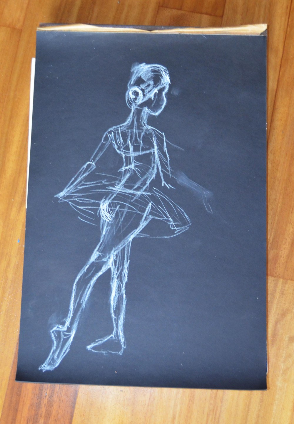
Just like when I paint with acrylics, I describe both the darkest and lightest areas of the composition right away. Here I used the white chalk pencil and some pink pastel for the lightest values, and ultramarine and the black surface of the paper for the darkest values.

dancer 3

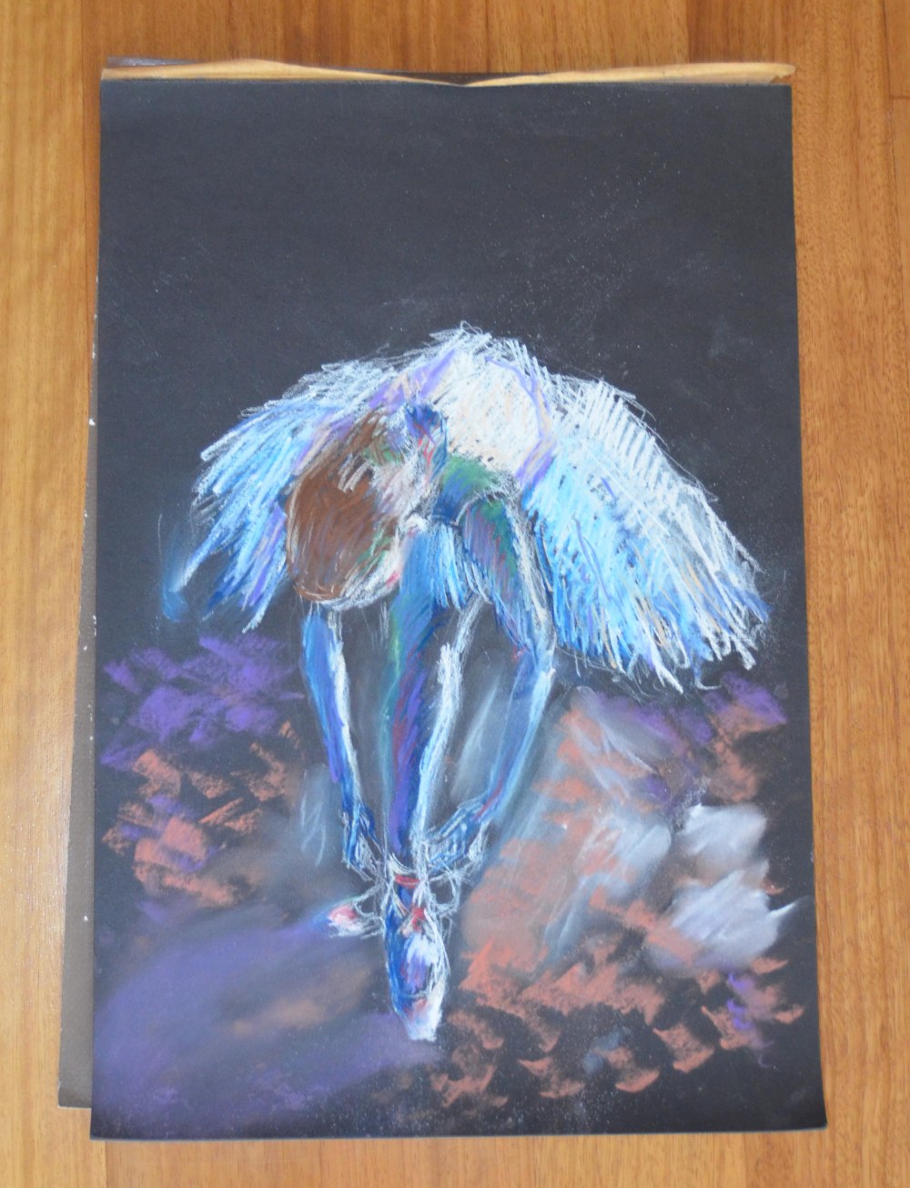
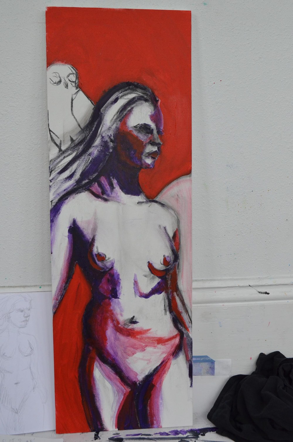
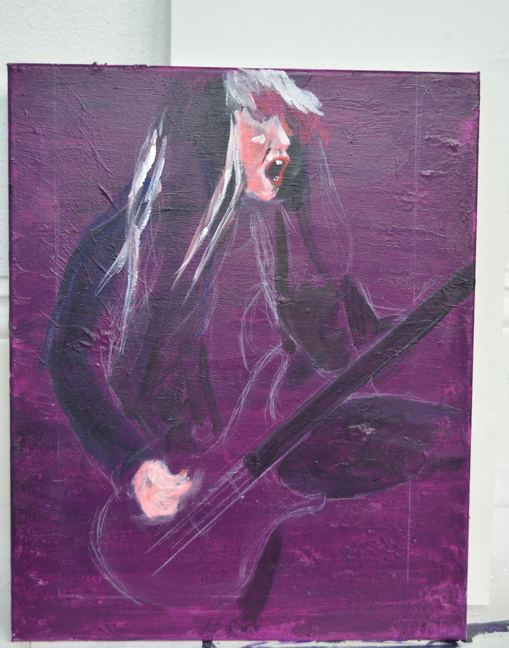
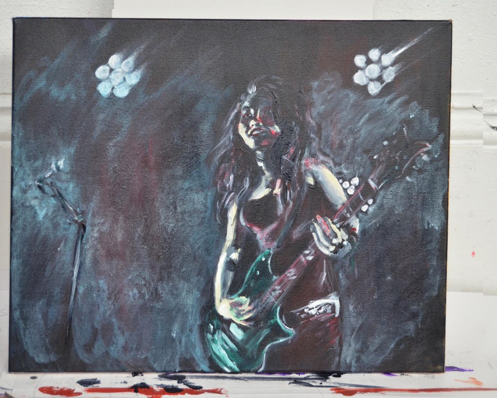
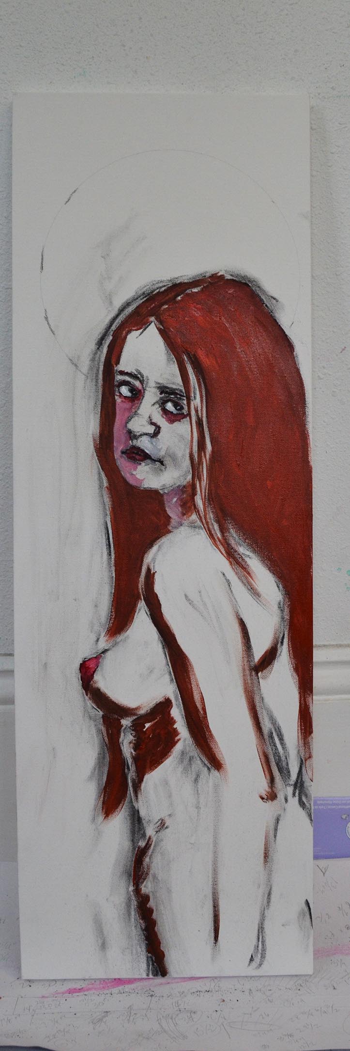
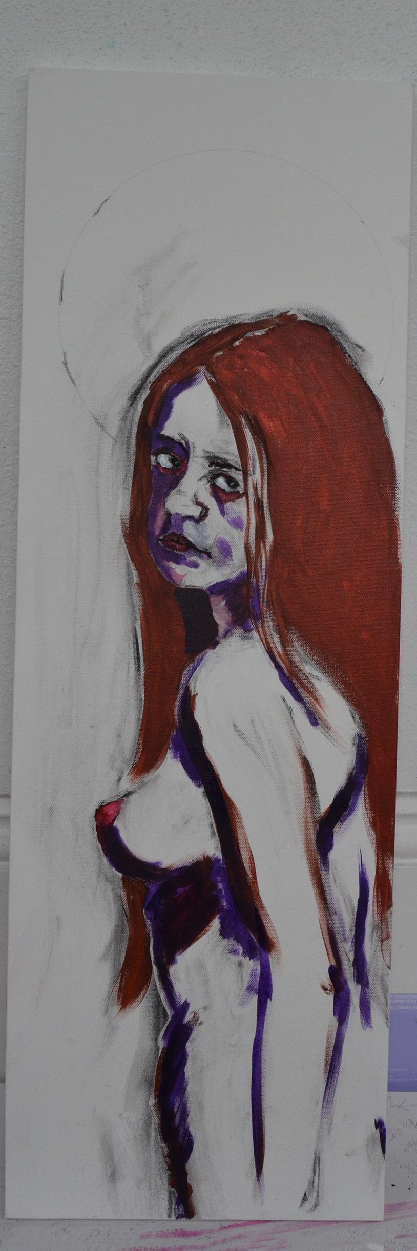
Developing the color scheme. More white chalk and white pastel in the lightest areas, especially the skirt of the dancer’s tutu, and the reflected light on her back. I built up the blues of the shadows using both light and dark blue, and blending them with the white areas. I use a paper towel or my fingers to blend the pastels, and also to get ‘blurred’ areas, which can imply movement, or areas that are outside of the viewer’s focus. I used a lavender for the shadow, which I will correct later.

dancer overview

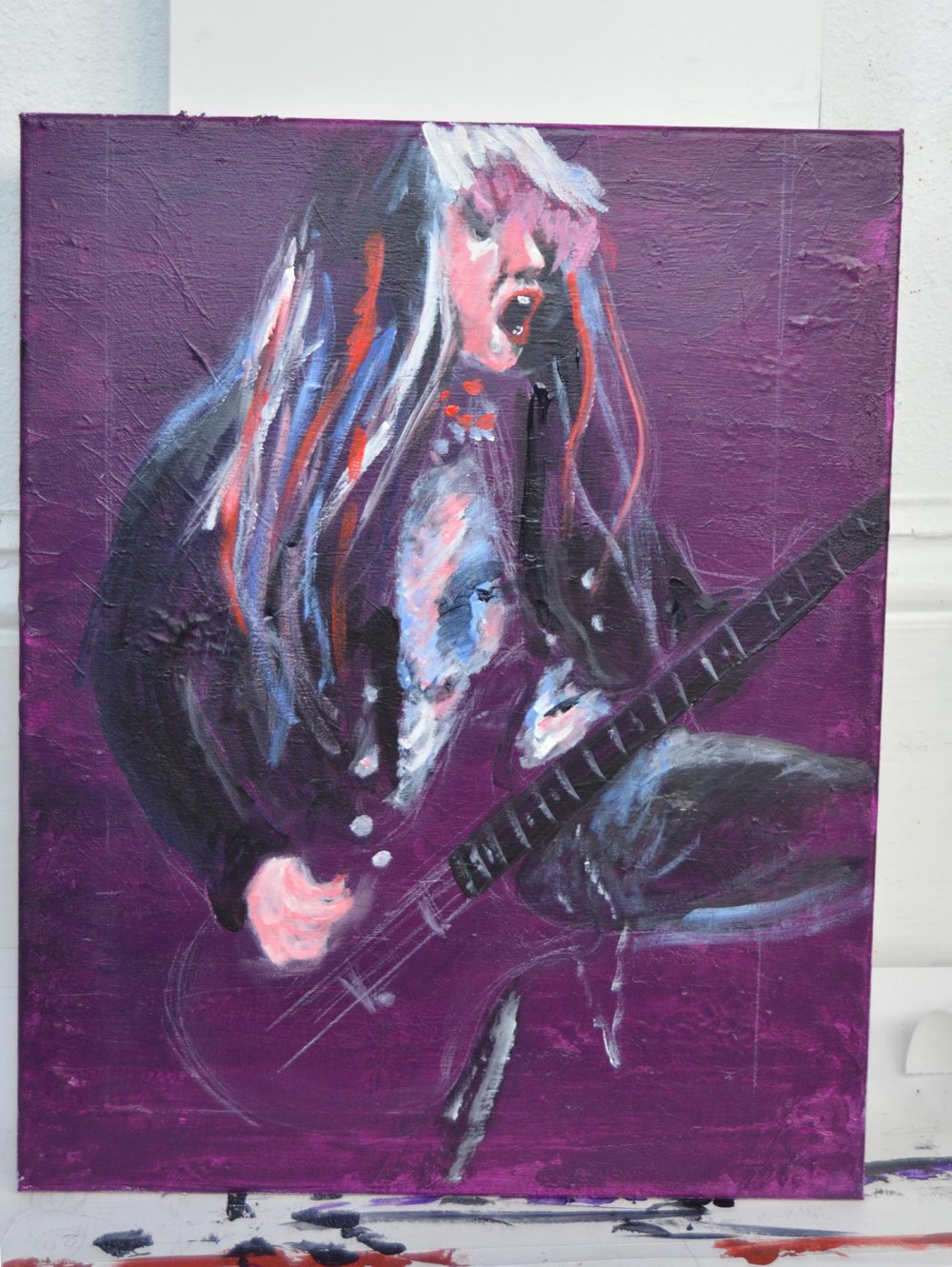
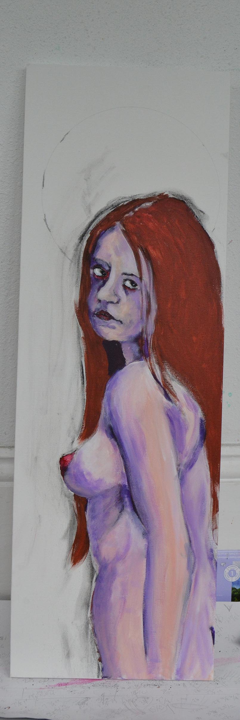
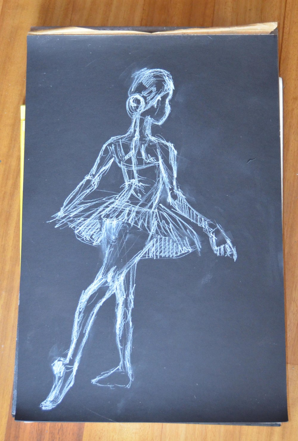
Almost done. I began to work in much finer lines in the shadow, the reflected light on the stage, and in the hair and clothing. Again, this gives the piece movement. Even though the dancer is in a more static position, I want her to look active, and to capture her focus on the task of adjusting her laces. I work at this point to perfect the lines of her limbs, as these and the skirt are the most defined areas of the piece. These are also the elements I am most drawn to when painting dancers: the movement of their arms and legs, and the flow of their lines. I also offset the large fields of white and blue by adding a little green in the shadow areas. As the composition develops, note that the shapes of the lights reflected on the stage reinforce the overall pose of the dancer.
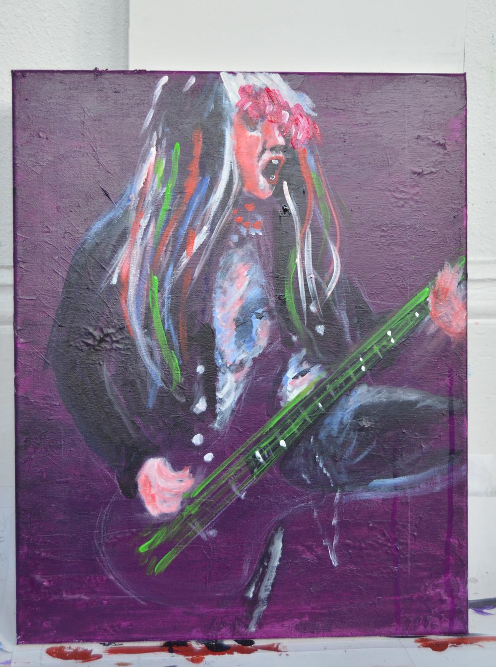
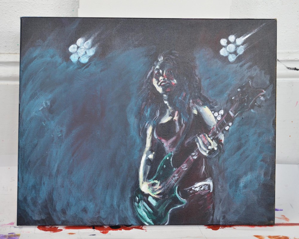
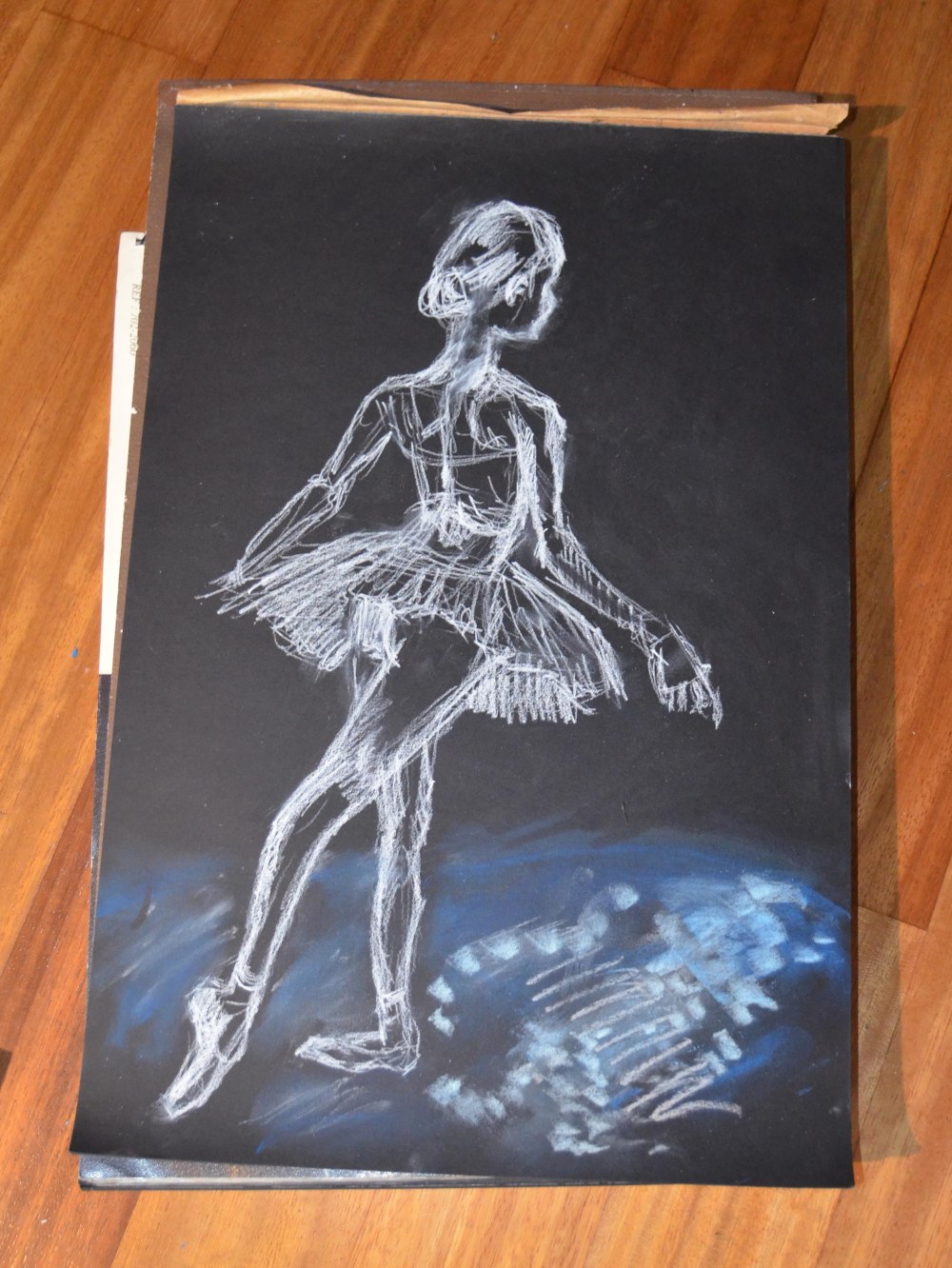
Finished:

dancer 8

I think I put about as much pastel on the surface as I could before the tooth began rejecting the medium. I think that’s a feel that comes with a lot of practice.

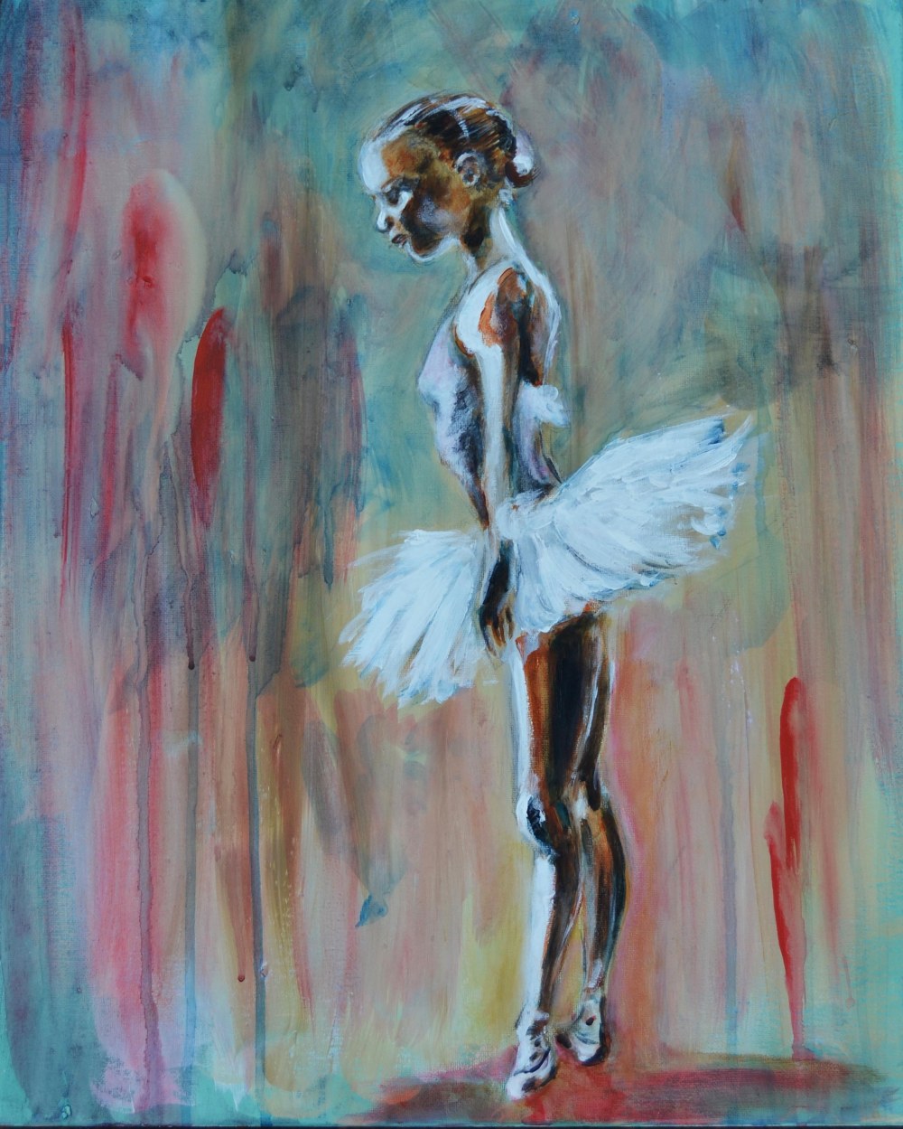
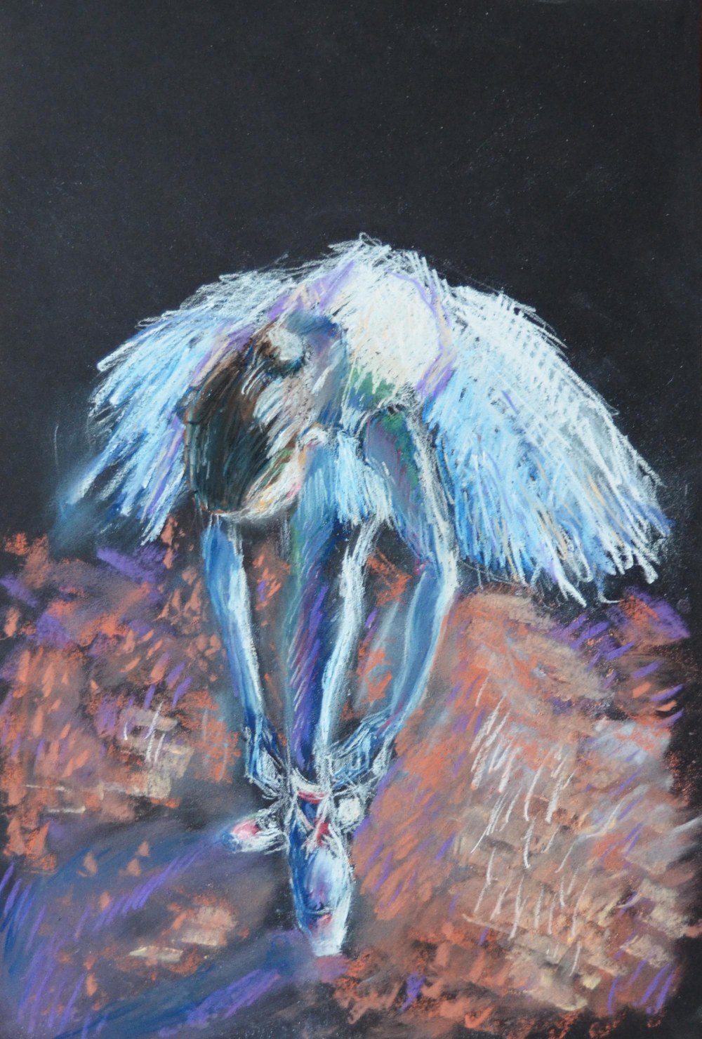
Next I began this painting:

dancer dress rehearsal

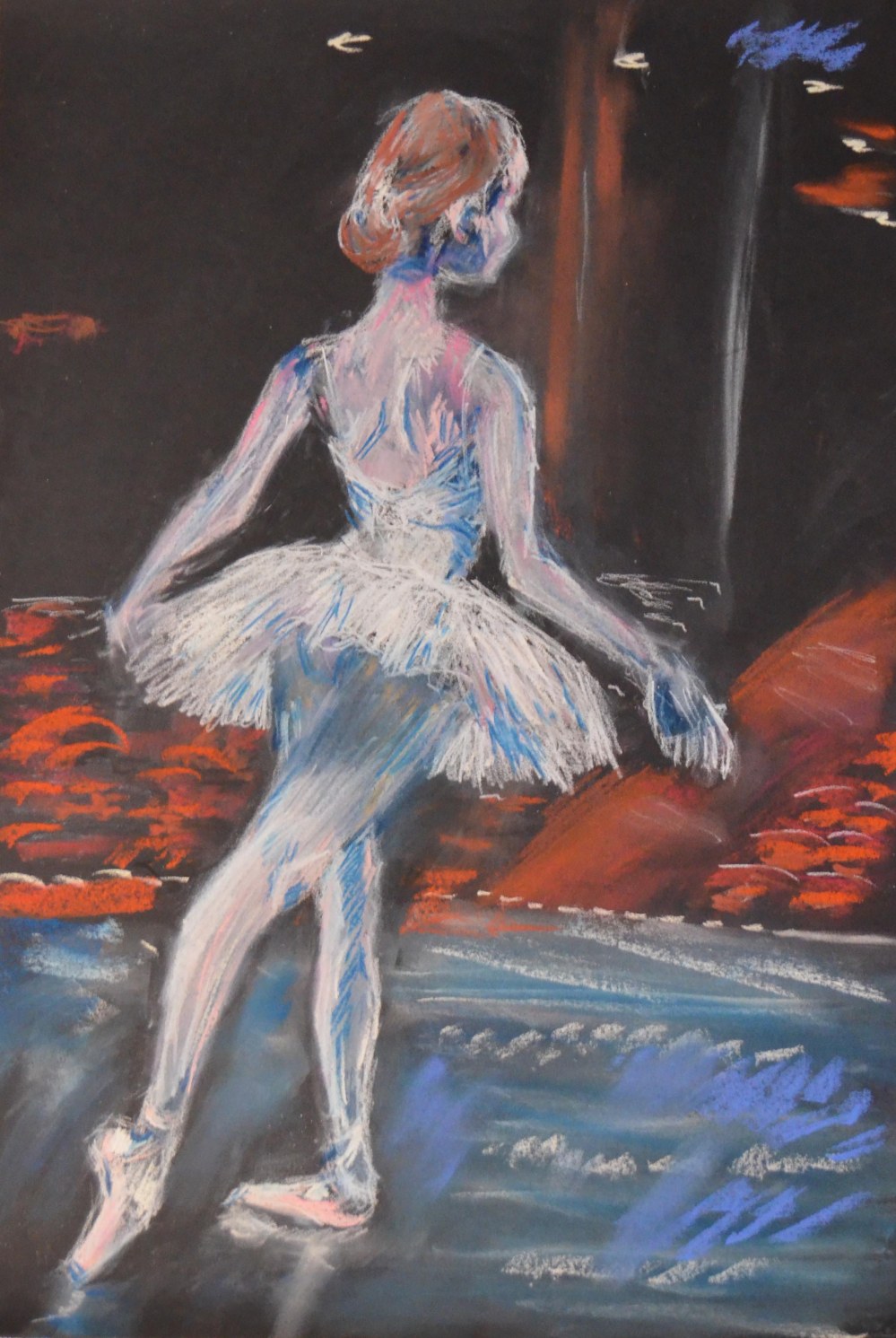
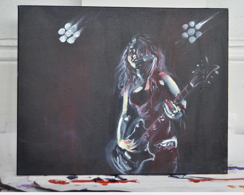
Dancer: Dress Rehearsal. Pastel on black paper.

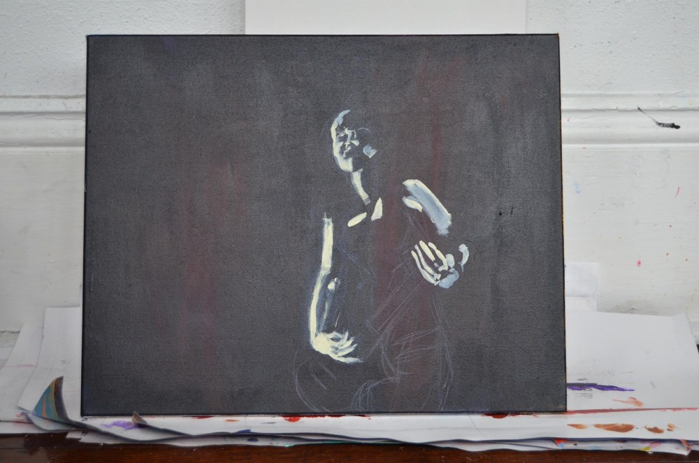
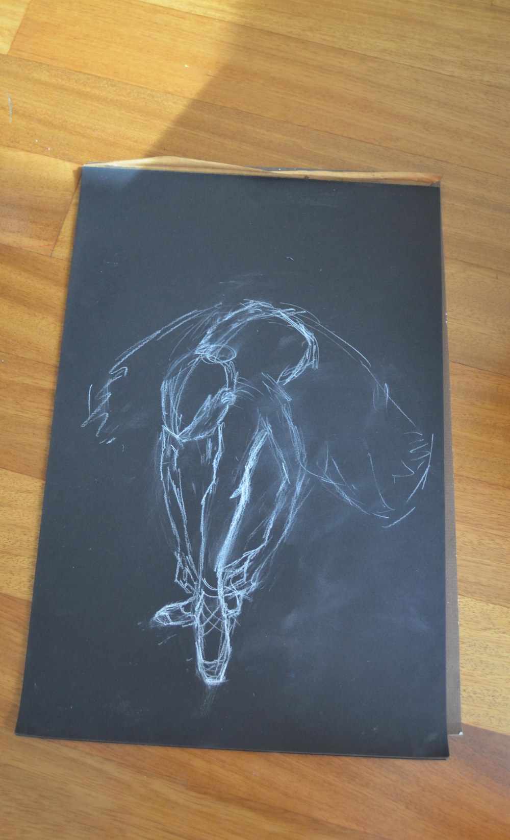
Again, I began with white chalk pencil on black paper. Here is the very first step, what I call a gesture drawing, mainly showing the flow of the lines of the subject:

dress rehearsal 1

I develop that by adding details of the limbs and clothing. Note that I was not happy with the angle of the arm, and I erased it:

dress rehearsal 2

dress rehearsal 4

Now the arm is right. I’ve added light values using the chalk pencil. Those will be blended into the coloring when I start applying the pastels.

Her head is still a bit large, which I will correct as I paint. One great thing about pastel and chalk is that you can use a standard eraser. You just don’t want to erase too much, as you’ll damage the tooth of the paper. But a few fine adjustments are possible. Still, it’s important to remember that pastel is not as forgiving as acrylics: you can’t just paint over an area. Fine tuning is possible, but not major overhauls. In that case, you need to just start over.

dress rehearsal 5

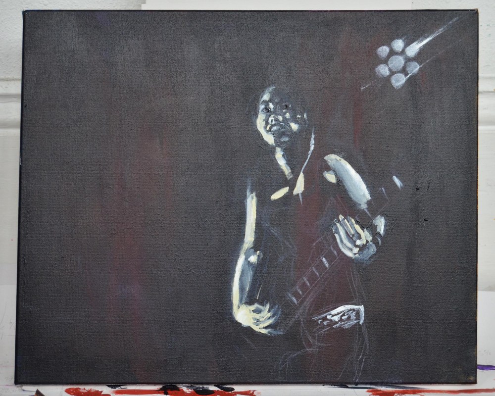
I began adding the reflections of light on the surface of the stage. Partly this was to establish my color scheme (though the color scheme here is very similar to the last painting, Dancer 8). Note I’ve also really started defining the flow of the skirt, and the lighter areas of the legs.

dress rehearsal 6

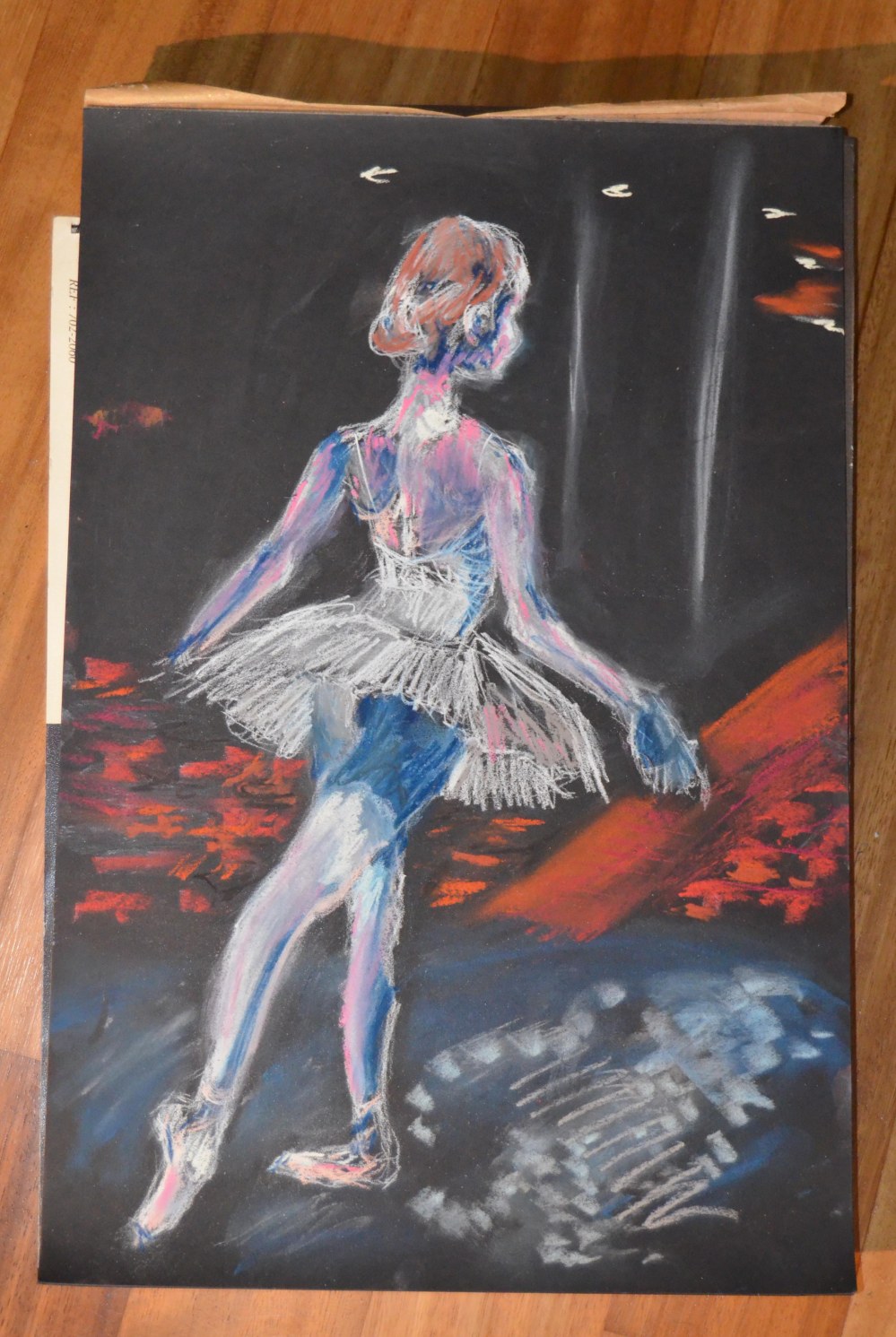
Here I’ve applied the darkest areas in ultramarine. I’ve also begun laying in the background: rows of seats in the theater, and lights in the ceiling. The colors of the skin and hair, and of the tutu and tights, all still need to be blended and tweaked. I will also add more reflection and color to the stage surface.

Finished painting:

dancer dress rehearsal

I really pulled back the shadow falling on the upper legs under the skirt. I also added the reflection of the dancer’s slippers on the stage surface.

Pastels take some practice, but I love the medium. Some advantages: they are very inexpensive. A starter set of 15 or 20 colors can be found at Michael’s or Dick Blick for about ten bucks. Paper is a much cheaper medium than canvas, though you can buy a medium to apply to stretched canvas or canvas board to make a tooth for soft pastels. And boxes of pastels stack easily, so you can store hundreds of colors in a small space. pastel 1

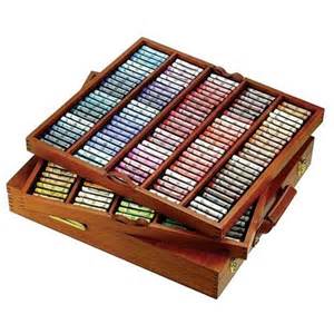
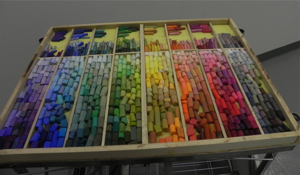
These are photos I pulled off the internet just to show how easy it is to store a lot of soft pastel sticks. Compared to tubes of paint, these hardly take up any space at all. A stick also lasts a long time. I end up acquiring a lot of pastel sticks: whenever I see them on sale at the art store, I buy a box or two.

pastel 2

Soft pastel is a great medium. Experiment, sketch and paint with them, until you get the hang of how easy and quick these things are.You can make quick sketches like Cassatt, or spend hours or days making masterworks like Degas or Manet. In fact I’ll leave you with a well developed Toulouse-Lautrec pastel. Hopefully seeing the pastel works of the masters will inspire you as it did me:

study-of-a-dancer-1888

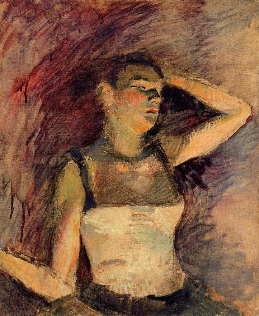
Study Of A Dancer, Henri Toulouse-Lautrec. Note that Toulouse-Lautrec added water to make the background “run.”

Thanks for looking. Please ‘like’ and comment.

Centaur: Shepherdess, Step-By-Step

Centaur Shepherdess

Centaur: Shepherdess

I’ve been painting a lot of mythical beasts lately. It was a turn I took a few weeks ago, when I thought that eventually I will launch a web site, etsy shop, etc. to try to sell some paintings (still a little bit away, but I’m thinking about it), and wondered, what would people buy beside half-naked mythic Goddesses? The answer came to me when, as I explained last blog post, a friend needed a unicorn painting. I became a bit obsessed with exploring the theme of mythic beasts.

Here are some of the paintings I’ve done in the last few weeks:

Unicorn Neptune

Unicorn Neptune

Unicorn Jupiter Io

Unicorn Jupiter with Io

I wanted to do some centaurs, but I also wanted to put a spin on them. Centaurs come from Greek mythology, though they were known in myths from around the world. The Greek centaur, despite its name (the ‘taur’ syllable is the same as ‘Taurus,’ meaning bull) is seen as part human and part horse. But centaurs from other mythologies have other animal parts. I hit on the idea of centaurs from localized regions, and started the project with a northern European centaur (mythically speaking, Scandinavia/Sapmi is my place of power):

Centaur Moon

Centaur Moon

So my next idea, aided by a trip to the Natural History museum, was an East African centaur.

African culture had a huge impact upon the mythologies of the ancient world. Several dynastic rulers of Egypt were from the lower Nile (the areas that today are Sudan and Ethiopia), and if you look at the earliest Egyptian sculptures, the Pharaohs had distinctly sub-Saharan features; Many Jews come from the lower Nile region, and some people believe Judaism originated in Ethiopia.

The sculptures above, from the earliest Egyptian dynastic period, have distinctly sub-Saharan features (as you would see in modern Ethiopian peoples); compare these to the well known sculptures below of Akhenaten and Nefertiti, rulers of Egypt in the later dynastic periods. These figures have features one would associate with modern Egyptians, who look more like contemporary Semites.

Nefertiti_Akhenaten

In visualizing an African centaur, I looked at various animals native to East Africa, and decided on a springbok. I love their supple shape and graceful lines. I also looked at many photos of tribal African people, and used an amalgam of several photos.

Centaur: Shepherdess

Acrylic on canvas, 24×36

Colors used: titanium white, ivory black, red ocher, cobalt blue, viridian hue, raw sienna, burnt sienna, burnt umber, cadmium yellow, cadmium yellow light, cadmium red hue, ultramarine.

Brushes: large and small coarse hair brushes, such as used for painting houses: small angled brush; small filbert.

I began by ‘reclaiming’ a canvas that I was unhappy with (a painting I did a couple of years ago of three muses. I never really liked it). I painted over it with red ocher and some brighter yellows. I thought to use this background as the final backing for the piece, but this painting changed directions many times as I worked. That’s something that’s part of my process, and I’ve learned not to fight it.

centaur 1

I really like the charcoal sketch when I look at it now, but as with the background, that would change drastically as I painted.

centaur 2

I began by coloring the springbok body, using titanium white and cobalt blue. This is a bit against the way I usually paint: I usually place the darkest shading first, then paint light colors over them. But not today… I also began placing the flock of springboks that the shepherdess is tending into the background.

centaur 3

This is when the piece took its first major turn away from what I had originally planned. I decided the piece needed a much more developed background than the simple color pattern I had started with. I wanted the look of the springboks’ habitat. This would of course take some real work…I used cobalt blue mixed with titanium white for a sky background, and began making shapes suggesting grasses in the foreground and shrubbery in the background.

centaur 4

My GF, who acts as my editor for paintings (a painting is not ‘done’ until she tells me it’s done!) suggested that the human body be slimmer and more graceful, to match the shape of the springbok; I visualized the human part as fitting exactly where the springbok’s neck would fit. So the human body changed quite a bit, including placement of the limbs:

centaur 5

I became very frustrated with the face, which I was taking from a different photo than the (human) body. I painted it over and determined to begin again.

centaur 6

But try as I may, I was not happy with the face. I determined that the human head was simply too large for the body. This is likely because as you might have seen, the whole human part started out much larger and broader: I changed the body shape, but failed to change the size of the head to match. So, ‘off with her head,’ as a certain fictional character might say… I also changed the angle of the torso, which was not right when I thought about the movement of the human half turning to face the viewer.

centaur 8

centaur 9

Much better! (Though my GF preferred the larger head…ah well. You can’t please everyone, even the people closest to you. You have to please yourself first). Newly angled torso, smaller head, more impressionist styled face.

A little more fine-tuning, and I had a finished painting:

Centaur Shepherdess

I guess this blog post shows, if nothing else, that while working on a painting things can change quite drastically. You just have to go with your instincts, even if it makes more work for you. I’m still not 100% sure I’m happy with this. It was an experiment: for one thing, since I’ve been focused for several years on European Goddesses, I’ve never painted East African skin tones before, though I’ve wanted to for some time. This gave me the opportunity, one which I will continue with (I think at this time in history, supporting cultural diversity in any way we can do so is really important: as an artist, I can do this by painting other peoples and cultures than what I am used to painting…) . And I did love painting the springboks.

My other choice for an African centaur body was the kudu, and I may do a second painting on this theme with the kudu base, and a thicker, more muscular human body. You can always see my work on my DeviantArt: http://kennyfiddler.deviantart.com/ to see what else I’m painting.

As always, thanks for looking. Please ‘like’ and comment.

Unicorn, Step By Step

unicorn-001

Unicorn 001

Unicorn 001

Acrylics and glitter, 16×20.

Colors: Green-yellow, hooker’s green, permanent green light, crimson, ultramarine blue, magenta, mars black, titanium white, glitter in a glaze medium.

Brushes: large flat and large round, 10 filbert, 1/4″ angled brush.

I haven’t posted in a long time, and I apologize to my followers (both of you). I’ve been having a tough time, and a lot of transitions. Blah blah… but here I am.

So, unicorns… I hope in the future to create more of an online presence to sell paintings. I’ve thought about what will sell beside naked Goddesses, and since I paint mythological and folkloric subjects anyway, I thought I’d paint some mythical beasts. And I thought I’d start with some unicorns.

Really it began because I was at a friend’s house for the holidays (Christi Swing, whose music I have posted here), and she was certain her boyfriend was going to make her a unicorn as a gift. I knew he was not (although the gift he was making her was pretty awesome). One of the guests in the house had some paints and canvas sitting out, so I borrowed materials and painted her a unicorn to ward off dissapointment:

unicorn-00

I liked the painting, and it gave me ideas. Paint unicorns!

So for the current unicorn, I started with a background of green-yellow and magenta (pardon the shadow falling across the photo):

unicorn-1

When that had dried, I began to shape the unicorn’s head and neck, using several horse photos. I used a blend of crimson and ultramarine, which I used throughout the painting process.

unicorn-2

A note here on the subject of unicorns: Americans have come to visualize unicorns as horses with a single horn. However, if you look at classical examples such as the unicorn tapestries hanging in the Cloisters, you will often see unicorns portrayed as having goat-like features. Mythologies from throughout the world have included antelope unicorns, goat unicorns, and deer-like unicorns. For this painting I chose the features of a horse.

unicorn-tapestry

The goat-like unicorn portrayed in the medieval Unicorn Tapestries on display at the Cloisters museum in New York City.

Let’s go on with the painting: I began shading out areas of light and dark, using ultramarine, crimson, and titanium white:

unicorn-3

More shading. I also added the shape of the horn, and some hills in the background using the three shades of green listed above, and titanium white:

unicorn-4

Things start to take shape and form: I began working on the horn, and adding magenta for more lighter definition. Also more work on the background: I added more green-yellow throughout the backing, and I used a light blue (ultramarine and light blue (shown) mixed with titanium white) to create some towering shapes. This gives a bit more depth to the background, and adds an aura of mystery:

unicorn-5

I was not thrilled with the shape of the neck and shoulder, so I added greens to redefine that area of the beast. Then I developed the hills and spires in the background. Also more work on the horn, and a little more shading:

unicorn-6

Final painting. I worked up the mane in magenta mixed with titanium white. I defined the ears a little better using the blend of ultramarine and crimson, along with some magenta. At the suggestion of my GF, who is my second brain, I added glitter into the mane and horn by mixing glitter into Liquitex glazing medium and brushing that onto those areas.

unicorn-001

I’ve been experimenting with a new signature, a four or five stroke shape of a wren. You can see it in the lower left corner of the painting.

Thank you for looking, and please “like” and comment.

Color Theory, Color Choices

This post definitely contains artistic depictions of the nude female form. I have warned you!

In my last post here, we spoke about color theory. I wanted to speak a little more about my own color choices while I am in my process of painting.

As an artist, you have three major elements to work with: shape, color and texture. If you’re a sculptor, shape (or form) and texture become more evident than color; but as a painter, shape and color become more evident than texture, though texture still comes into play. Some painters sand their ground (their board or canvas) to get a very smooth surface, so texture is less evident, or conveyed only in shape and application. But other painters, myself included, will use a textured ground to get a particular effect.

862a9f24b50dc004e6a607764a0bce7a

Illustrator Ashley Wood often uses a textured board for his paintings, as seen above. Notice the texture made by impasto application of gesso and paint. This work appears to be on a board that has some holes in it as well. I find that really exciting. (Above piece by Ashley Wood, who holds all rights).

blond-study

In my painting Blond Study, above, I used a very textured canvas, which I prepared by applying a couple of layers of opaque paint over a work I was not happy with. Those layers of paint laid over the original painting, and formed interesting textures over which to paint the figure.

Aside from shape (the shapes expressed in your painting, in this case the figure and impressionist background) and texture (less evident in a painting), the artist’s primary tool is color. What colors will you use? How and why will you use them? Blond Study is a good place to start talking about color choices, and I’ll be referring back to some of the color theory we discussed in my last post.

When I post paintings on social media, my followers (both of them) often comment that my color choices shouldn’t work, but surprisingly, they do. In truth, I love experimenting with odd color combinations. In Blond Study, I had painted over an older piece using colors I knew would cover the canvas; Payne’s Gray, which is dark and opaque, into which I painted two different hues of yellow. I knew I’d want to make the model’s hair blond (yellow), so I wanted yellow in the background to accentuate this.

After I sketched the model, I began thinking about color choices. To harmonize with the backing, I used a combination of Payne’s Gray and Prussian Blue for the darkest shadows on the model. Payne’s Gray is an obvious choice for shadow, but Prussian Blue is not. I like my shaded areas to pop, but remain dark, and the blue does that. I then used a combination of Unbleached Titanium (which is a neutral), Titanium White (also neutral), Cadmium Orange and Cadmium Red for the flesh tones (so red and orange were the only vibrant colors, as opposed to neutrals). None of these should actually work as flesh tones, but they harmonized well and ended up working. I added Orange to the Payne’s Gray and Yellows in the backing and to small areas of the figure to bring drama to both (note the orange shadowing on the model’s fingers).

primary-secondary

Why did these colors work? The backing is Payne’s Gray, which is a gray (neutral) tinged with blue. Looking at the color wheel, blue is juxtaposed with yellow and red (they form the primaries triangle); I did not want to use obvious reds, so I focused on primary, secondary and tertiary colors in the yellow third of the color wheel: yellow, orange and green-yellow (the wheel above does not show tertiary colors: see below). The green-yellows are not at all obvious, but if you look closely at the model’s hair, you’ll see that using yellow over the blue tones of the shading produced a green-yellow hue in the darker layers of the blond hair. My model did not have green in her hair, but this hue brings out the textures in the yellow portions of the hair. The blue shades are also apparent in the darkest portions of the hair.

Here’s a wheel that shows tertiaries:

colorwheel

Moving on… here is another example:

nude-in-green-orange-and-yellow

My process for this study was similar. I did a background in three shades of green (Green-Yellow, Hunter’s Green, and Permanent Green Light). Yellow is adjacent to green on the wheel, and red is opposite, so I used these two colors for the figure, with Purple shading (bridging the colors Red and Blue), and touches of Orange (bridging the colors Yellow and Red: see color wheels). I allowed a lot of the green backing to show through.

People are not green, nor are they yellow. But the shapes in the piece tell your eye that this is a person, and the darks and lights tell your eye that there is light falling on the person, and that there is shadow where light is not falling: light and shadow are the ways in which our eye detects form, so the eye perceives the form of a model. The yellows allow the light areas of the figure to pop against the greens of the backing and the purple of the shadows (consider the positions of yellow and purple on the color wheel). My decision not to use blue allowed these colors to stand up for themselves, and to accentuate the warm nature of the palette (blue is a cool color; as is green, which becomes the only cool tone in the piece. Purple, with its red component, acts as a warm color).

Notice I also used brush strokes to achieve texture. That’s the influence of my love for Ashley Wood, and Impressionists like Manet and Monet. The job of every artist, musician and writer is to synthesize their influences, and from that synthesis, create a unique style identified with themselves. This takes a combination of craftsmanship, regard for one’s influences, and honing one’s own instincts. This makes you greater than the sum of your parts, so to speak.

For my two most recent pieces, I decided to use fantasy colors to depict mythic creatures.

faun

This Faun began as a dream I had where I saw myself painting a green figure on an orange canvas (I really do paint in my dreams). I woke up thinking about that color combination. If you look at the color wheel, you’ll see that green and orange occupy opposite sides of their half of the color wheel, separated by yellow.  Taking tertiaries into account, they have the variants of green-yellow and yellow-orange to play around with and to separate them tonally. Remember that colors become defined when placed near other colors.

In this case I began by painting a canvas Orange, then adding Purple tree forms: Purple (violet) is directly opposite yellow, the uniting color between green and orange, so in a sense green, orange and purple form a triangle of secondaries. That’s slightly more complicated color theory. Think of it this way: if you see the color wheel divided into halves, green, yellow and orange form half the wheel: they can pop when shaded with any color from the other half: blue, violet (purple) or red. I used the middle color, purple, for the tree forms. I used red for shading on the figure. I would also use a Purple (Magenta) for eyes, lips and nipples. So we have a triangle of colors on the color wheel. The base of the triangle is formed by  green and orange: the point of the triangle can be any of the three opposite colors, blue, purple or red. When the point of the triangle is purple, it is a triangle made up of the three secondary colors.

faun-2

I started the figure by creating areas of light and shadow, allowing a lot of the Orange to show through. This created three “zones:” a neutral zone (Orange is NOT a neutral color, but it was neutral in relation to the piece because it’s the background color), a dark zone, and a light zone. I developed the figure by developing the three “zones,” using reds to blend with the lights by mixing with Titanium White, and to darken the darks by applying impasto. I added the antlers using purples and neutrals (Parchment, Titanium White, Mars Black) as well as green.

faun-4

I then used green to highlight elements of the piece. I also chose a green bird (a wren) as my Faun’s companion. Even though green is a cool color, the greens stand out on the predominantly Orange and Red palette. The slashes of body art also stand out in the palette (look at the finished piece above the two in-progress photos).

Last, let’s talk about another recent mythic piece, a Satyr:

satyr

For this piece I began by painting the canvas  green-yellow and turquoise. I knew I wanted to use purples for the figure, and looking at the color wheel once again, green-yellow is directly opposite purple (purple is often called violet by artists: I’m using the terms interchangeably here). I used dark browns for the tree forms (burnt and raw umber and sienna). These are neutral colors, but dark enough to stand out well against the palette.

I let the blues come forward in the purples of the figure (making them true violet hues), and then used an opposite shade of purple, Magenta, for eyes, hair, lips and nipples. I let a good deal of Titanium White show in the lightest areas of the figure. The Satyr’s companions are Lilac-Breasted Rollers; I chose these birds because they are native to Greece, but also because their lilac breasts and blue-green plumage would pop in the palette. I added green to the Satyr’s eyes to harmonize with the background.

Why does this work? I kept the palette very simple, setting yellow-greens against their opposite, violets (magentas and lilacs). I kept the “zones” of the figure simple as well: very blue-ish purple for the darks, violet for the mids, and lilac with a good deal of white for the lights. Purple is a mix of red and blue, so it can act as a cool or a warm tone: against cool greens, it acts as a warm. The much warmer magenta of eyes, lips, nipples, body paint, and hair pops because of the overall palette. The birds have such a varied plumage that they help to bring the simpler color scheme together.

I’ll leave you with a final recent study, a seated figure. Take a look at the palette, which is a contrast of cools and warms, and see if you can come up with some ideas about why the schema works (if you think it works…).

girl-with-flower-figure-study

Thanks for looking, as always. Please “like” and comment.

You can follow me on social media. I post my paintings, and my photos. Lately I’ve been photographing things I find while out walking: dead animals, cemeteries and autumn blooming flowers.

My Instagram is killthehero2

My Twitter is killthehero3

My Deviantart is where I post the majority of my paintings and photos.


Tackling Color Theory

There might be some artistic depictions of the nude form below. Just sayin’. All artwork is mine unless otherwise noted: all rights apply to my own work and to the work of other artists which I’ve respectfully used as examples of content.

Artists tend to be artistic, not technical: it might be safe to say that most artists, musicians and poets did really crappy at math in school. So when you mention the word theory to most artists, they get a little distracted, change the subject, or turn an odd color. It’s just, all those rules, right? That’s true of music theory, poetic composition, color theory… you name it.

But the truth is, as an visual artist, it’s really important to know color theory and composition. I did a post on here about composition several months ago. Now I’d like to talk about color theory: both how to stick to it, and also how to break the rules (artists like the ‘breaking the rules’ part).

Color and form are the basic elements of art. As artists we constantly use color. Even if you work in a non-color medium, like pencil, or ink, you are implying color: the human eye fills in areas of more or less graphite or ink and assumes these to be colors. The minute you apply pigment, you are working in color, even if it’s only one color.

a_christmas_card

Above: In this pen-and-ink illustration by Aubrey Beardsley, the textures and patterns of black India ink cause the mind to sense colors. You might describe the skin as white, the woman’s shift as grey, and the quilt as black: yet all of that information comes from the same two materials, ink and paper.

paige_63_by_kennyfiddler

Above: In a black-and-white photo, only one color (black) is printed in a varied grey scale on white paper, yet the mind perceives an array of colors. Black tones and the white paper combine in dozens of ways to form multiple shades of black, grey and white.

There are several types of color: there are “warm” colors and “cool” colors (we’ll talk about that in just a bit), and there are neutral colors. The neutrals are mostly blacks, greys and whites, though browns and earth tones might fall into that category when viewed artistically (Neutrals tend to be very muted colors). But the colors that are considered ‘colors,’ or hues, are categorized with a chart called a color wheel.

Guitarist with skulls beads

Above, my painting Guitarist With Skull Beads is primarily black and grey, with just a hint of red ochre (a warm neutral) and olive green (a cool neutral).  Below, an illustration by Ashley Wood, all in neutral colors (ochres and siennas) except for the pop of red hair.

ashley-wood-hk-venture-exhibition-8

The Color Wheel

Let’s start with three colors or hues, the three primary colors on the color wheel. Primary means these colors are prime: they cannot be mixed using other colors, or broken down into other colors, (like a prime a number, a number which cannot be divided without a remainder except by one or itself). The primary colors are red, yellow and blue, and we express them on a color wheel in a triangle like this:

primarycolorwheel

These colors are primaries: you cannot mix other colors to get these colors. The way they relate to each other on the wheel tells you how they will interact in a painting: their relationship to each other is equal. Red will compliment blue or yellow. Yellow will compliment red or blue, etc. Also red is a “warm” color, meaning hot or fiery. Blue is a “cool” color, it implies cold or subdued emotion. Yellow can go either way, depending on the colors around it. Yellow can appear in the flames of a fire (warm), or in the light cast by a blue sky (cool). Yellows like ochre or yellow oxide are neutrals.

Here’s a painting in which I used only the three primary colors; blue, red, and yellow ochre; with Payne’s Gray (a blue-grey neutral value). I mixed red with titanium white for the skin tones. The viewer’s eye moves between the hair, because red is the warmest value, and the eyes, as the blue there is a light value (and the human eye tends to focus on eyes). Because only primaries are used, the face may look a little ‘clownish,’ a little too bright.

acoustic guitarist

More color wheel: secondaries and teriaries

While you cannot mix any colors to achieve the three primary colors, you can mix the three primaries together to get what we call secondary colors. Red and blue make violet (or purple); red and yellow make orange; and yellow and blue make green. This makes the color wheel look like this:

primary-secondary

Remember that the triangle of red, blue and yellow are the primaries: the colors between them, violet, orange and green, are the result of mixing those primaries.

It’s a good idea to play with these color combinations yourself, by painting a color wheel. Yours might look like this:

painted-color-wheel2

Below is a painting composed of reds and blues, but with green in the background. Green, a secondary color, becomes a ‘supporting’ color, which harmonizes with the reds and blues. Imagine a song like Simon and Garfunkel’s ‘Mrs. Robinson.’ Paul Simon sings the lead vocal, and you can hear him distinctly. Art Garfunkel sings a harmony, which supports the lead vocal and adds a lot of texture to the song, but you can still clearly hear that Simon is singing the melody.

The green in this painting does the same thing. You can see that the green is there. But because green is opposite red on the color wheel, the green helps the red and blue to pop. It is a supporting color.

Robin

Here is another example of the same thing: In my depiction of Blodeuwedd, the green fields of the background support the red hair and red and blue/purple skin tones to make the hair pop, and to accentuate the shadows on the skin. The eye stands out as the lightest value on the face. The eye color is echoed in the tiny meadowsweet flowers, which draw the eye in a circle around the figure.

bloudewedd-2

Finally, you can mix the primary colors with secondary colors, and get a whole bunch of new colors. these are called tertiary colors:

colorwheel

The tertiary colors explore the full spectrum of color combinations. They include color blends like yellow-green and red-violet. When painting, you might mix your most present colors to get these sorts of combined colors.

Using all the colors

In this water color, note the many blends of reds and blues in the skin tines; also note the varying blends of blue and reds in the trees, blending from blue to violet to purple. Also notice how the reds pop because the overall composition is violet.

Bloudewedd 4

In working with colors, as a general rule, warm colors will stand out from cool colors: shadows might be cool (blues and purples); areas of focus might be warm (reds and oranges). Of course this is a general rule and you will see many, many exceptions.

Child Of The Moon

Child Of The Moon (acrylic on canvas) sticks to the general rule. The figure’s lightest values are warm colors (reds) and her hair is deep red: the background and atmospherics are cool colors (purples, lavender, all related to blue: and also yellow). The shading on the figure is blue/violet, causing the lighter skin tones to pop. While the moon is a very large light valued space, it is lavender (cool), so it fades back a bit from the warm valued light skin tones.

 eve

This painting by 60s Margaret Keane influenced artist Eve is an exception to the rule. Even though it is a cool color, and despite the warm orange of the girl’s outfit, the eye is drawn to the boy’s blue jacket, and to the blue eyes of the girl. Note how the blue jacket and orange outfit divide the canvas, creating a warm-cool flow back and forth. Almost like a yin-yang symbol.

 In general, when looking at the color wheel, opposite colors will compliment each other. Colors next to each other will harmonize. So if you want to paint a tree that is primarily green, your background might be reds, because red is opposite green on the color wheel. You might also use blue, as blue is next to green, so they harmonize (same with yellow). To create a bit of tension between fields of color, find the color opposite on the wheel, then move one or two values to the left or right in the tertiaries. So if your primary field is a tint of red, for instance, green would be opposite: a blue-green with a lot of blue in it, like aqua, might create tension against the red. Same with a green-yellow.

By no means are these hard fast rules: you can use pretty much any color with any other color to achieve a particular feel or emotion. Sometimes colors that clash horribly, like bright reds with pinks, might convey the emotion you want to express.

dancer-4

In my painting of a dancer, above, I only used neutral colors for the figure: titanium white, payne’s grey, yellow oxide, burnt and raw sienna, and burnt and raw umber: Except for two primary colors; prussian blue in the shadows and background, and cadmium red hue in the background. The bright primary reds in the background cause the shaded areas of figure to appear darker, and lend more drama to the dancer (at least that’s what I was hoping for). Note that I applied thick layers of impasto white to the tutu and the highlights in the dancer’s skin. This balances the watery layers of color applied using two techniques, wet-in-wet, and as layered washes, to the background.

dancer-at-the-barre

An effective use of color is to draw the eye to one element first, and detract from other elements, letting the eye fall on them later. The largest fields of color in Dancer At The Barre are neutral, secondary and tertiary colors: secondary purples and pinks, along with large fields of neutral white and black. There is a tiny application of primary red in the eyes and lips. What jumps out at you? What do you notice last?

As photography became accessible in the late 1800s, painters had less responsibility to depict reality (as cameras could now do so), and more freedom to express their subjects through form and color. Among the first group of artists to take advantage of this freedom were the French Impressionists, who relied heavily on color to convey emotional impact.

Here are two paintings by Edouard Manet:

manet-a-bar-at-the-folies

In the piece above, Manet plays with realism and impressionism: the central figure, the bar maid, is very realistic. But Manet himself, reflected in the mirror, is more impressionistic, as are the background elements of the audiences and the chandelier. Manet uses bright colors in the foreground to bring the eye to the bar maid: the many, many details of the background are muted, and noticed later. Manet himself, reflected in the mirror behind the bar, is noticed last, as he is most muted, and off to the side of the composition. Manet often mixed realistic elements with impressions, almost as if he’d just grown tired of painting details at some point in the process.

In the piece below, Manet again used color to draw the eye to the two female figures, one of whom, the bather, is completely out of proportion to the foreground figures. Again, muted colors in her surroundings cause the eye to move to the very bright figure of Victorine Muerant first, then the triangle of the sitting painters and bather, and finally the very muted forest. The entire painting is done in secondary and tertiary colors, making Meurant’s red hair and blue drape pop dramatically.

manet-02-web1

By the twentieth century, many schools of painters had moved well away from depicting realistic form and color. Pablo Picasso sought to reduce both form and color to their most primal elements, which is called ‘abstracting’ form and color by artists. Here is a Picasso portrait:

portrait-of-sylvette-david-in-green-chair-1954-jpglarge

The first thing you might notice is that the overall tone is blue, a cool color. This is harmonized by green, the color beside blue on the wheel; the only pop of drama is the orange in the figure’s nose and the background. Even though blue is a cool, calming color, the tiny bit of warm orange gives the piece an unsettled feel. Even though Picasso painted the eye facing the viewer, the pop of orange makes us feel she is looking forward.

Mixing

As you paint, you will invariably seek to vary a color by mixing in other colors. Any color value is referred to as a hue. Artists often use the word hue when describing colors mixed from pure color, like yellow-orange.

If you mix any pure color with white, you’ve created a tint.

If you mix any pure color with black, you’ve created a shade.

Tints and shades add dimension to your color element. When I add shadow and highlight to skin, for instance, I tint or shade the overall skin color (I usually use vermillion or cadmium red tints for skin) to get the highs and lows. I also use blues and purples for shadow: purple harmonizes with cadmium red, as they are next to each other on the color wheel. Blue and red are both primaries, so they might either blend or clash. But I feel that the cool property of blue works well to add shadow to the warmth of red. I might then mix tints of vermillion, mixed with anywhere from a little to a ton of white, to add dramatic highlights (look at my many step-by-step tutorials here to see how that works).

muses-2

This color scheme in my painting of three of the nine muses really shouldn’t work, but I think it does. The overall hues are yellows and greens, both cool colors. The green is a secondary, yet it dominates the painting. Deep green eyes and red-yellow hair, plus the perspective, draw the viewer’s eye to the gaze of closest Muse. Note the splashes of color in the figures’ bodies that act as shading and highlight. The only blue, the uniting color, is in the book that the second Muse is cradling.

Color Tricks

Years ago I picked up a great book, Color And How To Use It by William F. Powell (I found it just now on Amazon: https://www.amazon.com/World-Color-How-Use/dp/9998723450). Powell talks extensively about color combinations and how they draw the viewer’s eye. One trick he suggests is to determine what the principle color of your piece will be; then take a tiny pin sized drop of that color, and mix it into every color you use on the piece. It’s an interesting suggestion, as it will add a teensy bit of harmony to every other hue that you use.

I rarely mix special hues: I use color right out of the tube. One thing this allows me to do is come back to a piece in a day or two, and use the correct color to correct or develop something. I don’t have to mix the color just right, because I used a particular color that’s sitting in its tube right there. Of course I’ve made tints or shades (usually tints—I seldom mix with black to make a shade). I use those when developing the area.

In watercolor painting, one technique is to build bold colors by applying washes, thin layers of a particular color, one after another over each other. I have found that this works well with acrylics as well. I paint many layers of a particular color over dried layers, adding tints or shades to get desired results. I use wet-in-wet a lot. Water is your friend when painting with acrylics. Sometimes I’ll paint a wash of color, then towel it off after a moment, to get just a suggestion, just a hint of that hue over the dried color on the canvas. To see an extreme example of using wet-in-wet and layers of washes, scroll back up to my painting Dancer 4, above.

When using acrylics, most colors come out of the tube impasto, as a thick paste. But this is not true of certain synthetic pigmented colors, which come out very watery. Prussian blue and phthalo green are good examples: to achieve the right tone, the factory uses a very watery or thin plastic binder to hold the pigment. Sometimes when I squeeze a tube of synthetic paint onto my palette, I get a clear liquid first, before the color comes out. You can use the texture of these synthetic hues to your advantage, by painting with them thinly over a dried or heavily impasto area of lighter color. So if I’ve painted a large area of skin, using a pink tint made of vermillion hue and titanium white, I might shade areas of the skin using prussian blue, which will apply in a very liquid coating, then I’ll wipe some of the blue away: because prussian blue is a synthetic pigment, it will dye the area (rather than coating it) and when I wipe the paint away, there will be a dyed area that still carries some of the prussian blue. You can see the result on the neck, the rib cage, and the thighs of my depiction of Athena, below:

Athena

I could probably say a LOT more about color theory and use of color, and in my step-by-step blogs I do… I’ll also maybe do some step-by-steps that focus more on color theory in the future.

I hope this little look at color theory was useful. There are a ton of books and tutorials out there on color theory… use them! Thanks for looking. Please ‘like’ and comment.


When The Moon Is Full, Step-By-Step

This post contains artistic depictions of the female nude form. If that bothers you, look no further…

when-the-moon-is-full

…When The Moon Is Full… Acrylic on canvas, 24×36

I’ve been doing some witchy, occultish stuff lately, as you may know. My newest acrylic painting is a witchy depiction, inspired by a piece of Wiccan/Witchcraft liturgy called the Charge Of The Goddess. The first lines of the charge read:

Whenever ye have need of me, once in the month, and better it be when the moon is full, then shall ye assemble in some secret place and adore the spirit of me, who is Queen of all witches. There shall ye assemble, ye who are fain to learn all sorcery, yet have not won its deepest secrets; to these will I teach things that are yet unknown.

I found a great reference photo on DA, from a photographer who goes by RealKilroy:

vy5134_by_realkilroy-d6vy7py

Photo by Robert Ponomarev, aka RealKilroy.

I like the way the figure has an expression of bliss, and the way her hands are raised into the air, a stance witches actually assume during a full moon ritual. I also like the way her ribs show because she is outstretched.

…When The Moon Is Full

Acrylic on canvas, 24×36

Colors used: violet, dioxazine purple, titanium white, windsor violet, payne’s gray, vermillion hue, burnt umber, raw umber, burnt sienna, crimson

Brushes:  large filburt, 10 filburt, 8 filburt, small edger.

I began by painting an entire canvas with dioxazine purple and violet, both from the “cheap” student grade acrylics available at Michael’s. These paints are great for bigger areas, as they have pretty good coverage, and you don’t feel like you’re ‘wasting’ expensive paints (though if you read this blog, you know my stance on the complaint of ‘wasting’ materials). I then outlined my figure for spacial reference, knowing I would paint the moon over part of the outline:

moon-1

Note my t-square standing next to the canvas: I measured the center of the canvas (ground) to be sure the figure and the moon were centered.

My next step was to paint the moon. I mixed titanium white and violet to get a lavender: I then used violet to suggest the features of the moon’s surface, painting it wet-on-wet, meaning I painted in the violet directly into the wet lavender paint of the moon shape. I recommend using a medium for doing this: I used Liquitex glazing medium here, to make sure the moon shape remained wet as I mixed in the violet.

moon-2

I knew I wanted to have figures dancing behind the main figure. While waiting for the moon to dry, I sketched out dancers. I was immediately unhappy with the result, and I covered these figures up as I worked the painting, and decided to paint more of the primary figure before returning to these background figures.

moon-3

Here is the first pass at the skin tones. I used a mix of vermillion hue and titanium white, leaving large sections of the purple background showing through. I would also use just a tiny bit of windsor violet for shading, but later I ended up covering most of that with dioxazine purple.

moon-4

And while I had the dioxazine purple out, I covered up those figures in the background. That’s a great thing about acrylic paints: they are very opaque, and it’s easy to cover mistakes or areas that aren’t working (you can still see a faint hint of one figure).

You can see here that I used both vermillion hue and crimson to block out more of the shading. I wanted the figure to seem to rise out of the purples in the background, and to blend into the background in places. Also note the hands: as the piece developed, I would return to the hands and fix them up a bit.

The facial features were giving me some trouble at this point. In the reference photo there is a lot of light on the model’s face, and it’s hard to make out much delineation and shading. I would spend a good deal of time working on that…

moon-5

Above, I painted over the nose to get the shape a bit better. As you can see, I also began shading the face a bit more. I had to ‘fake’ a lot of the shading, but knowledge of the human face and form really helps in doing that. If you are a self taught artist, even if you do styles like Pop Surrealism, Anime or Manga, it’s really worth studying muscle and bone structure to get a sense of where things lie under the skin. This helps a lot with features and shading. There are tons of good books, and Youtube videos on drawing and painting facial features, skeletons and muscle structure. An exercise my class did in art school was to find photos of the human body in motion, such as pix of athletes, and draw in the underlying bones and muscle to get a sense of how these move when the body moves. It’s a good exercise.

moon-6

So the nose is fixed, and I’ve worked some more on shading the face and developing the hair. I used burnt and raw umber for the underpainting of the hair, then burnt sienna, crimson, and vermillion hue for light tones. There is also titanium white, payne’s gray and dioxazine purple in the mix. When painting hair, try to see the main shapes made by hair groupings. Hair should look light, and have movement. In this piece I used filburt and edger brushes, but sometimes I’ll use a fan brush to get the hair textures.

You can see that I resumed the atmospherics. This time I started by painting in some standing stones, using a photo of Calanais in the Outer Hebrides Islands as reference. In the next step I would use some photos of dancers to paint in the dancing group behind the main figure, keeping them very gestural, and using primarily the violets and purples of the background.

moon-7

As I mentioned, I was not happy with her hands. As I painted the shading on her hands and arms, it began to look like she had too many fingers. So I painted over the parts I didn’t like with titanium white. Then I would mix violet and titanium white to get the lavender I used for the moon, and repaint those portions of the moon in.

Here is the finished piece, as seen above:

when-the-moon-is-full

I put the group of dancing figures in the background, overlapping some to give a sense of depth. I also repainted the breast and nipple on the viewer’s left. The nipple was not sitting right. In the reference photo the nipples are a little bit uneven, as real nipples are when someone raises their hands above their head. But it did not ‘read’ right in the painting, so I changed it. I also worked for quite a while on the shading of the belly and hips. I shaded the face up until the very end of the process.

Being an artist means self-editing. You need to know when a piece is ‘done.’ If you are too much of a perfectionist (which I’m not: sometimes I wish I was a little more of a perfectionist) you might work a piece so much that you overwork it. You must also develop a sense of when a piece needs just a little more. It’s a very thin line, and only experience and practice can hone this skill.

Sometimes it helps to begin a piece with a clear vision of what you want the finished piece to look like. Then you can tell if the piece matches your vision. But many times art means happy surprises. Your piece might look different from your vision, but in a good way. This is the only way to develop as an artist. Sometimes I begin a piece with a very clear idea of the outcome I want: other times I begin with the sketch, and let the painting take me where it decides to go. Neither is wrong or right. Both are good ways to stretch your abilities.

So I decided this piece was ‘done’ when I could look at it and be happy with it. I might have shaded the face and belly even more. I might also have developed the dancing figures a bit more. But I also might have overworked the piece that way. You are the only person who can decide if you are happy with a piece (unless it’s a commission. But even then the piece should bear your style, and only you can determine if it does).

As always, thanks for looking at this. Please ‘like’ and comment.

Athena Step-By-Step

This post contains artistic depictions of the female nude. And of an owl. Proceed with all due caution.

Athena

Athena, acrylic on canvas, 12×36

I’ve tried painting the Greek Goddess Athena several times, and I was never very happy with the results. I even tried approaching her under her Roman name of Minerva. Still not happy. So I left Athena alone for a quite a while, and in time, returned to Her fresh. I am finally happy with my depiction of Her.

Athena

Acrylic on canvas, 12×36

Colors used: (pretty much all of them) cadmium red hue, vermillion hue, crimson, orange; parchment, titanium white, payne’s grey; windsor violet, violet; raw sienna, yellow oxide, lemon yellow; permanent green light;  turquoise; bronze, old gold.

Brushes used: small edger, 12 filbert, large filbert.

I began by looking for a reference image that would line up with the look I wanted for this piece. My vision of Athena is both beautiful, and strong and powerful. There are many women in the media who fit this bill, and whose image I might have used; Kim Hill, Kerri Walsh-Jennings, Aly Raisman, Katinka Hosszu, Nadia Comaneci, the list is a long one (and I am only listing strong and beautiful women whose skin tones would match a Greek/European deity: don’t go thinking I’ve forgotten about Laurie Hernandez or Allyson Felix!)… but in the end I decided to base Athena’s body and stance on a photo of Ronda Rousey. It’s easy to find photos of Rousey nude or scantily clad in poses other than those taken during sports events, as she has done many published photo shoots. Here is the photo I chose, from one of her Sports Illustrated shoots:

rousey 1

I like her pose in this shot, and I like the shading, which shows muscle definition but is also soft and feminine; I did not want to capture a portrait of Rousey, but I thought this stance would be a good start. I’d vary the features as I painted the piece.

I used a 12×36 canvas, which is what I always use for my depictions of mythic Goddesses; and as always, I began with a sketch in soft willow charcoal.

athena 1

You can see my sketchbook reference drawings next to the canvas. The face is far from right, but as I said, I did not want to duplicate Rousey’s features, so I left the face unfinished in the sketch. I also did the owl from memory, without a reference photo; I would find a good reference photo later on. Once I had a sketch, I filled in the background with vermillion hue. Putting in the backing color helps me set the tome for all colors of the piece.

athena 2

I used vermillion hue and windsor violet to begin the shading. I intended to clothe Athena, and give Her armaments and gear, but I wanted to create a full body image to begin from. I also began defining the facial features using the shading colors. I made the nose a bit more aquiline than Rousey’s, and the lips a bit fuller and more heart-shaped. I would fight with the hair line throughout this painting.

athena 3

Here was the first pass at the skin tones, using vermillion hue and titanium white. I also began to outline Her skirt.

Athena is portrayed at times as modest and other times as uninhibited, as fierce and wise but also vain. She is a Goddess of battle and of wisdom, tall, strong and intimidating; yet in competition with Hera and Aphrodite, She was willing to present Herself nude, and attempted to bribe Paris (offering to make him king of Europe and Asia) in order to be declared “the fairest” (for believers in mythology, see my footnote on this at the bottom). So I decided that while Athena has no issue with nudity, she would have arrayed herself as a warrior, in a short skirt and Her battle gear. I wanted the skirt to have movement, but also allow Her to move freely in battle.

athena 4

More work on the skin, and a beginning at shading the hair. My amazing, beautiful girlfriend had bought some metallic colors a while back. (She paints copies of illustrations from medieval manuscripts, and many of those have gold leaf or silver foil). I’d never really used these colors in a painting, but as Athena is associated with the sun, and with bronze (battle gear) and gold, I decided to use some of these paints. I began painting her shield in bronze. I also added iridescent medium to a few of the paints.

athena 5

Now I found some photos of Eurasian owls, including the one below, and began the shading. The base layer is raw sienna, with brush strokes that define the feather patterns.

bubo-bubo

Isn’t he a handsome fellow?

athena 6

Moving the brush with the shapes of the feathers, I did more work on the owl, using earth tones like raw sienna, yellow oxide, and payne’s grey. The owl’s eyes are payne’s gray and orange with titanium white and lemon yellow highlights. I also worked more on the definition of the skirt, using payne’s grey, windsor violet, bronze and white. I used long brush strokes to get the flow of fabric. I continued to define Athena’s battle gear. I used payne’s grey to create the spear and the harness, then filled both in with bronze, titanium white, and windsor violet.

I felt like I needed to fill the background a bit more. I had some gold paint (‘old gold’) in my metallic collection, and I decided to create a solar disc behind Her. I also decided to give Her more jewelry and adornments.

athena 8

For the solar disc I used old gold, then mixed in vermillion hue. When that dried, I laid over another layer of gold. I did this process two or three times. You can see that I also began defining the hair. My GF felt that the hair line was too far back. I would fix that in the final piece. I basically used every color in the painting for Her hair: the undertones are payne’s grey, crimson and windsor violet: over that I laid raw sienna and yellow oxide. I also added crimson and vermillion hue. Over that, lemon yellow. There’s also some payne’s grey in the outer strands.

Comparing the steps above and below, you can see the final touches to the face and hair; definition of garments and adornments; and more work on the solar disc.

athena 8

In the final painting I fixed Her hair line; I went over the solar disc the second (third?) time; I finished the owl; and I fine tuned the face and skin.

From the beginning I knew I wanted to create a feeling of depth by having Athena holding a spear between Herself and the viewer. However, I could not add that element until all else was done. I painted the spear in payne’s grey, then went over it with turquoise. The spear point is gold, brass and turquoise. I also added turquoise touches to the jewelry and adornments. I added gold in a few places as well.

Here is the piece, as seen above:

Athena

Thanks for looking; please ‘like’ and comment!!

A footnote on Athena’s mythology: in the case of the Apple Of Discord, it might be fair to think that as a warrior, it was Athena’s sense of competition, rather than a sense of vanity, that caused Her to place herself up against beauties Hera and Aphrodite to be judged “the fairest.” Of course, even though it seems like Eris set everyone up, the whole thing might have been a test for Paris. Robert Graves, one of the greatest interpreters of Mythology that ever lived, believes that the story of the Apple Of Discord relates to an older tradition of the Seven Year King, who would be honored by his community for seven years, then sacrificed to the Gods. This tradition existed throughout Europe, and Viking remains found in peat bogs seem to be the heroes of these rites (including some women: see Patricia Monaghan’s book on this). If this is the case, the three Goddesses would have given Paris the apple, not the other way around, to mark him as the seven year king; his death in the Trojan War would have been the sacrifice that was expected of him for this honor. In time the myth may have evolved into the story we know, (who’s theme is also played out in the tale of Sleeping Beauty: like Eris, it is the Faerie or Witch who is not invited to the feast that casts a spell on Belle/Talia).

It is a good idea when approaching classical mythology to remember that many hands have touched these tales and left their mark, for better or worse: we get these stories from ‘classical’ authors, such as Plutarch and Ovid, who collected them from story tellers, who in turn got them from centuries of storytelling. Writers tend to reshape things to fit their own agenda, as do cultures. It’s also wise to remember that myth is its own language, and must not be interpreted through the lens of modern ideals and morals, or seen as literal truth: myth expresses mythic truth. If you want to look deeper into interpreting myths and ancient tales, I’d suggest reading The White Goddess by Robert Graves, and also looking into Joseph Campbell (who I sometimes disagree with, but he is brilliant).


Bassist 2, Step-By-Step

Bassist--Rena Lovelis 2

Bassist 2—Rena Lovelis.

In following the path of painting images of musicians, I’ve sort of gone down a rabbit hole of female rock and metal guitarists. It’s an enjoyable rabbit hole, and I’ll probably see where the fall down it takes me. But rest assured, I’ll get back to painting nude Goddesses soon enough…

For the moment though, let’s look at my newest ‘sketch painting,’ of Cherri Bomb bassist Rena Lovelis. I painted a piece from a photo of Lovelis last week (you can see it on my DA) but I wasn’t completely happy with it (which is why this one is called Bassist 2). It did not have certain elements I wanted to capture (and my proportions kinda sucked). So I decided to try again.

When Lovelis was with Cherri Bomb she had this amazing multi-colored hair thing going on, and I wanted to capture that. I also wanted to capture that raw energy you see in rock and metal bands, an energy you don’t see as much in folk or alt bands (perhaps for very obvious reasons). So I chose a photo of Lovelis that expressed both (the credit for the photo appears on the pic):

Cherri-Bomb-Warped12-band-0154

Bassist 2—Rena Lovelis

Acrylic on reclaimed canvas, 16×20

Colors used: violet, ivory black, payne’s grey, titanium white, ultramarine blue, cerulean blue, vermillion hue, crimson, cadmium red hue, perm. green light, various other colors for hair.

Brushes used: small edger, 8 filbert, 12 filbert for background.

To begin, I had a canvas that had been painted on (by someone else) that I covered with several coats of violet paint. Thus I mention “reclaimed canvas.” Because it had been painted over several times, it has lots of bumps and ridges, which I kind of like. It gives a texture to the overall piece that one can either work with or against… You can get mediums that give you that texture, but they’re really just imitating an overworked canvas, so I went to the source.

As always, I began by creating a sketch, this one in white pencil:

rl1

Not perfect, but enough to begin work with.

Next I used titanium white, payne’s grey, and vermillion hue to map out the highlights and lowlights, and begin to structure the face and hand. I’d work those features all the time I was painting, trying to get them just the way I wanted, but this was a start. Notice that I drew some bounding lines to the bottom, left and right. This is because the dimensions of my canvas are wider than the dimensions of the photo, so to start, I wanted to get the measurements of the photo down (I use a ruler to get basic measurement ratios down when I sketch). I’ll mention this again later.

rl2

I really like the intense look on the musician’s face in the photo. I also like that while she is not looking at the viewer, you get a sense of her gaze and focus. I worked to capture that.

More work on the highs and lows. I added ultramarine to the mix, gauging areas of highlight on the pants, t-shirt and hair. You can really see the bumps and crevices in the canvas here. The mouth is still not quite right, the nose needs work, and I still have not placed her eye precisely. I’ll work on all of those as I go.

I started to map out the hair and the t-shirt, and work more on the face. The eye is still not right, and the front of the hair is too light. Because I’m working dark to light, it’s hard to get the colors really bright. It’s good to remember that dark and light values only apply to a color when it’s in the presence of other colors. Payne’s grey might be the lightest color in a piece: yellow might be the darkest. We see light and dark values as comparisons, not as absolutes. When working with a dark canvas, making colors ‘pop’ is difficult, and often takes several layers of colors, as they have a tendency to disappear into the dark background.

rl4

…This is why all of these colors were applied impasto, meaning as a thick paste, the way they come out of the tube. As we go you might be able to see that many of the trails of color in the hair and clothing stand up out of the canvas, (or create bumps), as the paint was applied thickly. This was meant to get the colors of the hair to ‘pop.’ Acrylic paint is essentially plastic glue with color pigment in it, so it can be used to sculpt as well as tp paint. I’ve known artists who work sculpted strands into a piece, or make objects out of semi-dried acrylic paints. While I was in art school my teacher did a demo where he painted a thick impasto piece on glass, let it dry, then peeled it off the glass, rolled it up, and walked off with it.

Back to Rena Lovelis… Next the permanent green light in the hair and on the bass. Lovelis used these distinctive green bass strings, which I actually know several bass players to use (hi Susan). In the case of Lovelis, the strings are a really nice repetition of her hair colors, so they work well for a painting. I’ve also started making minute alterations to the face, especially the mouth. The nose is waiting its turn…

rl5

Working the bass, and more hair colors. For the bass, I used paynes grey to get the shading and a hint of the wood grain, waited for it to dry, and went over that with crimson and titanium white. Right now I’m having an issue with the left hand (the hand that fingers the bass); the hand was not shown in the photo, but since my canvas is wider than the photo, I need to place the hand on the bass neck. At the moment the angle of the hand is wrong, and it’s throwing all of the angles of the piece off. It’s pretty amateurish, really, but I think any painter will tell you that hands are tough to capture. Drawing hands (and feet) again and again in your sketch book is a really good idea, and also, I suck at taking my own advice. Anyway, I need to correct that hand…

rl6

…So I painted over the hand with several coats of violet and fuscia, and I’ll go back in with perm. green light, cadmium red hue, and tit. white. Still working the hair, face, and t-shirt. I jeep checking the overall piece and correcting little areas. Right now there is not enough dark in the area of the neck (the musician has a lot of jewelry on, and only bits of it are catching the lights). I’ll also work the right hand a bit more, and the face. I think I finally got the nose where I want it. The eye looks right too, but needs a tiny touch up. I’ll also go over that large patch of cerulean blue on the pants leg, and add the jacket’s tail that’s seen in the photo.

rl7

And done (as seen at the top of this blog). I got the angle of the left hand, worked the right hand just a bit more, worked the eye a bit more. I lightened the fuscia bangs so they pop a bit. I worked the hair a bit more (I could probably spend another week on the hair, but you have to stop some time) so that the lightest colors pop. I worked the necklaces and the shadow at her neck. I added hints of orange to her hair. And I worked the background a little to mimic the stage lighting in the photo.

Bassist--Rena Lovelis 2

Thanks for looking, and please ‘like’ and comment. I’ll get back to some mythic Goddesses here soon, though I really like the musicians I’ve been doing, so I’ll likely go back and forth. I think it’s good to vary subject and style, as it keeps you from getting bored or stuck in a rut. Doing a few different styles really helps with developing each style: one style informs the other, and as you paint each, you take something away from one that you can apply to the other. At least that’s how it works for me…

I’ll leave you with a video of Cherri Bomb, whose bassist was the inspiration for this painting (she is now the singer for Hey Violet, who are a bit less metal and a bit more pop-rock).


Guitarist Step-By-Step

Guitarist Julia Pierce

Guitarist—Julia Pierce by KillTheHero. Acrylics on canvas, 16×20.

I haven’t written a new blog here in a couple of weeks. I will admit that is due to a combination of depression-induced lethargy, and round-the-clock Olympics coverage. Considering what team USA has been up to, it’s amazing that I’ve painted at all this week!

But I did, I’m happy to say…

I’ve had a project going for a few months that was inspired by the work of Ashley Wood. I’ve spoken before about my admiration for Wood’s work (fellow geeks may know him as the creator of Tank Girl). He is a master at using only two colors, three at most, to depict lithe figures and maniacal robots. Taking this inspiration, and combining it with my love of music and musicians, I’ve been depicting guitarists, using as few colors/tones as possible. I begin with a dark canvas, and bring up highlights from darkness. Shadow areas remain the background color. Here are two pieces I’ve posted before:

guitarist

Above, Guitarist, based on Shannon Curfman; Below, Guitarist With Skull Beads, based on Grace London.

Guitarist with skulls beads

I decided to do another painting in this series, using the image of rock/metal guitarist Julia Pierce as inspiration.

Guitarist–Julia Pierce

Acrylic on canvas, 16×20

Colors used: Payne’s Grey, Titanium White, Metallic White, Unbleached Titanium, Turquoise, Crimson, Violet

Brushes used: Small edger, 10 filbert

I used a photo of Julia Pierce that I found on a Cherri Bomb fan site. (All rights belong to the photographer). I used this shot, and also a wider angle of the same shot that showed her microphone to the viewer’s left:

th

I like the way this shot captures the energy of a live show. I also like the swirling colors captured by the smoke of the fog machine, though I knew they would be a PIA to capture. But you know me. I rose to the challenge!

I began by painting a canvas Payne’s grey, with slight hints of crimson. Then I outlined the figure, and captured the highest values, using unbleached titanium:

jp1

In the previous paintings in this series (posted above), I used titanium white for the highlights. However, in this photo, the stage lights are brighter than the highlights on the figure. To try and capture that, I went with unbleached titanium for the figure. I used my smallest edger brush throughout the process of painting the figure.

jp2

The eyes look a bit demonic here… I’ll fix that later. I’ve started placing the lights behind and above the figure. I’ll go back in several times and brighten those.

jp3

More lights, and starting to define her hair and her guitar. For the figure I used only three colors: unbleached titanium, titanium white, and crimson, over the Payne’s grey background. If I were going to use the same dictates as my previous paintings in this series, I would have stopped about here. But I really like the swirl of colors from the fog machine…so my challenge was to use those colors while staying true to the minimalist dictates of the series. I know, I’m getting very philosophical here…

jp4

A bit more crimson. and placement of the microphone. I also began defining the body of the guitar. In the photo, Pierce plays a green Schecter guitar, which is sort of her go-to instrument. I decided to stay with the green tones of the body of the instrument. I will say, the perspective on the guitar was tricky, and took me several tries (to still not get it perfect)…

My next challenge was the fog:

jp5

To capture the swirling fog, I began using washes of turquoise (a wash is a color mixed with a lot of water) and then swiping at the wash with a paper towel after it dried just a bit. I knew it would take many washes to get the effect I wanted…

jp6

More washes, all the while waiting a few minutes until the wash was just slightly dry, and swiping with a paper towel. Note that the mic stand has disappeared beneath the fog. I would go back in and re-paint that.

For the finished piece I added more washes of turquoise, T. white, and violet. I also added the set of lights behind the figure, and went over the lights several times with a metallic white paint I had laying around. The metallic white (and I do realize the irony of painting a metal guitarist with metallic white) is a tube of the ‘cheap’ level 1 paints at Michael’s; those cheaper colors come in really handy, and I always stock up on them when they come on sale and become even cheaper. They’re also good for backgrounds, as I don’t feel like I’ve used a lot of ‘expensive’ paints for a large area of canvas. Of course I’ve said this before: don’t become a painter unless you are willing to ‘waste’ gallons of paint perfecting your craft!

The finished piece:

Guitarist Julia Pierce

I feel like I captured the energy of a live show, and that I did OK with the fog. I think the piece still registers as built up from dark, like the other paintings in the series.

Thanks for looking; please ‘like’ and comment if so inclined. I’ll leave you with a video of Julia Pierce’s playing with her former band Cherri Bomb…


Child Of The Moon, Step-By-Step


This post contains artistic representation of breasts. And of the moon, but no one seems to get bent out of shape about the moon.

Child Of The Moon

Child Of The Moon, Acrylic on canvas, 16×36.

Recently my amazing, wonderful GF has been reminding me how much I love the Rolling Stones from the mid sixties to the early ’70s. They were OK when they were an English band doing American Blues covers (I’m willing to forgive Mick for not knowing the towns along Route 66). But when they started writing (famously influenced by Lennon and McCartney), and recorded Satisfaction, they really transformed into something new: a band that had a unique approach to songwriting, and that could combine various styles into their base style of American Blues. Over the next couple of years they would experiment with British Folk, Mod, and Psychedelic, moving through two guitarists (Brian Jones (RIP), and Mick Taylor), before bringing in Ron Wood and settling back into their Blues roots. At which point I lost interest in the Rolling Stones.

I’m old enough to remember dimly back into my childhood when Nineteenth Nervous Breakdown hit the AM airwaves. A few years later my struggling guitar fingers eked out the opening riff to Honky Tonk Women. (I have that down now, thanks). As a somewhat scraggly tween I saw their first tour with Mick Taylor (it was amazing). And as a young adult, I saw the influence the Stones had on Punk, Hardcore and even Rap and Hip Hop.

Why do I bring this up? (Oh no, KilltheHero, not another long winded discourse on music history). Don’t worry… I bring it up because lately I’ve been painting esoteric themes, like my last two pieces, Morgana, and The Sorcerer’s Daughter. So a Witch painting was brewing in my brain, when my delightful, beautiful GF reminded me of an old gem of a Rolling Stones tune which does not get the love it deserves, Child Of The Moon.

Such a great blend of modal British folk with the Rolling Stones’ signature blues-rock guitar sound, and oh, that trill on the sus chord (that’s a musical term for that jangly bit at the top of the song). Back in the days of the vinyl single, the song was the B-side to Jumpin’ Jack Flash, and the poor wee thing never got put on an LP until the greatest hits album years later.

So the point is this: while I was pondering a witch painting, my GF brought up this tune, and it seemed like the image I’ve put in my head to this song since I was a tiny larval child was the perfect image for a spooky beautiful witch scenario. Inspiration comes from all sorts of places.

I had run into a photo on DA that I liked, and had saved it to use someday (please note this is not my photo, and I credit the artist and use it with respect):

sheis_by_ssuunnddeeww

Sheis by ssunnddeeww on Deviant Art.

I used the pose, although I changed the face of the model to look a little more British and a bit rounder. I also added her far arm into the pose (which would be the model’s right arm). I felt it balanced the painting a little better.

Something we’re going to talk about with this piece is using color washes, a technique common in watercolor, but which can be used with acrylics. A wash is an application of paint diluted with water. In this case I also used acrylic glazing medium in diluting the paints.

Child Of The Moon

Acrylic on canvas, 12×36

Colors used: skin; unbleached titanium, vermillion hue, titanium white, windsor violet. hair; red oxide, windsor violet, orange, deep red, cadmium yellow medium. background; windsor violet, violet, lemon yellow, green-yellow. moon; windsor violet, thalo silver, titanium white.

Brushes used: 8, 10 and 12 filbert, 6 edger, liner.

As always, I began with an underdrawing in vine charcoal:

cotm 1

When you look at my drawing, you may not see all of the anatomy underlying the shapes of the body and head. I spent grueling years in figure drawing classes getting the feel of bones and muscles to be able to draw a plausible figure. I recommend figure drawing to anyone who wants to draw or paint; and I mean to draw or paint anything. If you can draw the human body with all of its shapes and subtleties, you can draw pretty much anything. Just a bit of advice you probably didn’t ask for…

As I often do, I defined the eyes, lips, shading of the nose, nostril, and the nipple. When you look at the body, these are the areas that stand out, since they are a different color than the skin over the rest of the figure.

Next I decided to fill in the mass of the hair. I usually save the hair for later, so that it can fall over the skin, but in a moment of staring at the drawing I decided the hair would give me a clear boundary between foreground (the figure) and background (the orb of the moon, and the sky). I used red oxide to block the hair and for a beginning of the body shading. For the face shading and the nipple, I began throwing together red oxide, vermillion hue, windsor violet and titanium white.

cotm 2

More shading, with windsor violet, following the contours of the ribs and shoulders, and defining the contours of the face…

cotm 3

Now I begin blending the skin tones (here is where the washes come in). I used unbleached titanium, vermillion hue, and titanium white. The unbleached titanium gave me a slightly darker skin tone than my usual. I used washes to blend and tone down the darker shading that I began with, as seen above: a wash is simply paint applied in a very watery form. On its own, a wash will dull the color of the paint, since it’s diluting the amount of pigments in the paint: but washes can be built up, one on top of another, to intensify color and form. This is a common technique in watercolor, and I apply it to acrylics. To get a wash, I diluted the paint with both water and acrylic glazing medium.

cotm 4

In blending skin tones, I often use both hard and soft brushes. In fact if a brush begins dying on me, and grows hard from paint drying in the bristles, I keep it to use for blending and texturing. I also use my fingers a lot when blending paints. I really like using my fingers, and I feel like I can get better control of blending that way, especially with a wash (as opposed to impasto painting).

I keep blending the skin tones by applying washes of color, and begin blocking out the background. I knew I would want violet and yellow in the background. So I just started placing those colors into the piece, letting them develop and allowing them to suggest textures and forms to me. If you look at the area under the moon and to the left of the figure, I wiped that area with a paper towel to get some texture to paint over later with washes.

cotm 5

I want the moon to be silver, with the darker features of the lunar surface visible. First I painted the whole orb with thalo silver and titanium white. Then I blocked out the craters with a wash of windsor violet, let that dry, and began adding more washes of thalo silver mixed with titanium white and glaze medium over it. Note that I’ve also started defining the hair: I moved from the moon to the hair to allow various layers of wash to dry.

cotm 6

The piece is taking shape nicely. I keep putting silver washes on the moon, and developing the skin and hair using washes of color. Beside washes, I also use thicker (impasto) applications of paint in the hair.

I’ve lost the features of the moon a bit in the photo below. In the finishing touches I went back over those features again with a windsor violet wash.

cotm 7

Below is the finished piece, as seen at the top. I finished the washes and features of the moon, and put a cloud over the face of the moon. I used more layers of windsor violet, violet, and cadmium yellow medium washes in the background, and also put in a green-yellow point implying a distant light or perhaps a will-o-the-wisp. I developed the hair more, going darker in places—one of my painting teachers used to stress the importance of going darker with shading, saying that many painters are afraid to go darker, and those words stay in my head now as I shade. Finally I developed the figure’s back a little more, and darkened the far arm.

Child Of The Moon

And there it is. Thanks for looking. Please ‘like’ and comment. You can find me on Deviant Art, and on Twitter as @killthehero3.

And experiment with wash techniques. Try them on paper and on canvas. You can get some pretty cool results.